
Univariate Distributions#
Michael J. Pyrcz, Professor, The University of Texas at Austin
Twitter | GitHub | Website | GoogleScholar | Book | YouTube | Applied Geostats in Python e-book | LinkedIn
Chapter of e-book “Applied Geostatistics in Python: a Hands-on Guide with GeostatsPy”.
Cite this e-Book as:
Pyrcz, M.J., 2024, Applied Geostatistics in Python: a Hands-on Guide with GeostatsPy [e-book]. Zenodo. doi:10.5281/zenodo.15169133 ![]()
The workflows in this book and more are available here:
Cite the GeostatsPyDemos GitHub Repository as:
Pyrcz, M.J., 2024, GeostatsPyDemos: GeostatsPy Python Package for Spatial Data Analytics and Geostatistics Demonstration Workflows Repository (0.0.1) [Software]. Zenodo. doi:10.5281/zenodo.12667036. GitHub Repository: GeostatsGuy/GeostatsPyDemos ![]()
By Michael J. Pyrcz
© Copyright 2024.
This chapter is a tutorial for / demonstration of Univariate Distributions in Python with GeostatsPy including:
Histograms
Probability Density Functions
Cumulative Distribution Functions
YouTube Lecture: check out my lectures on:
For convenience here’s a summary of the salient points.
Definitions#
Let’s start with some basic definitions with respect to univariate, bivariate and multivariate.
Univariate - involving one variable (feature) or event.
Univariate Statistics - summary measures based on one feature measured over the samples
Univariate Parameters - summary measures inferred for one feature measured over the population
We start with univariate, but we will cover bivariate, involving two variables (features) later. Note, joint probabilities and distributions are:
Bivariate - regarding 2 variables (features)
Multivariate - the general term for \(> 1\) features, but often refers to \(\ge 3\) or more).
Massively Multivariate - high dimensional, usually indicating 7 or more features
Now, let’s describe the concept of a distribution.
Statistical Distribution – for a variable (feature) a description of the probability of occurrence over the range of possible values. What do we get from a statistical distribution?
what is the minimum and maximum?
do we have a lot of low values?
do we have a lot of high values?
do we have outliers (values that don’t make sense and need an explanation)?
Histogram#
A histogram is a bar plot of frequency over an exhaustive set of bins or categories. A histogram is calculated with the following steps:
Divide the continuous feature range of possible values into 𝐾 equal size bins, ∆𝑥, or categories,
Count the number of samples (frequency) in each bin, \(𝑛_(𝑘),\quad \forall 𝑘=1,\ldots,𝐾\).
Plot bin probability versus mid‐range, \(\left( 𝑥_{𝑘,𝑚𝑖𝑛} + \frac{\Delta x}{2} \right)\) if continuous or the categorical label.
Typically, the bar chart bin width is set to \(\Delta x\) so the bars touch and extend over the entire range from \(𝑥_{𝑘,𝑚𝑖𝑛}\) to \(𝑥_{𝑘,𝑚𝑖𝑛}\) for each bin, \(k\).
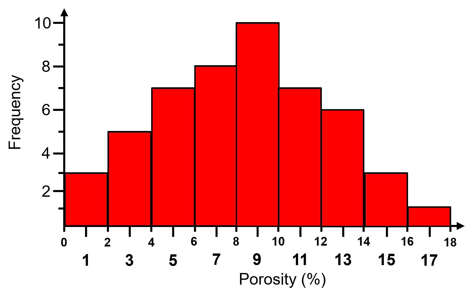
Here is an example histogram,
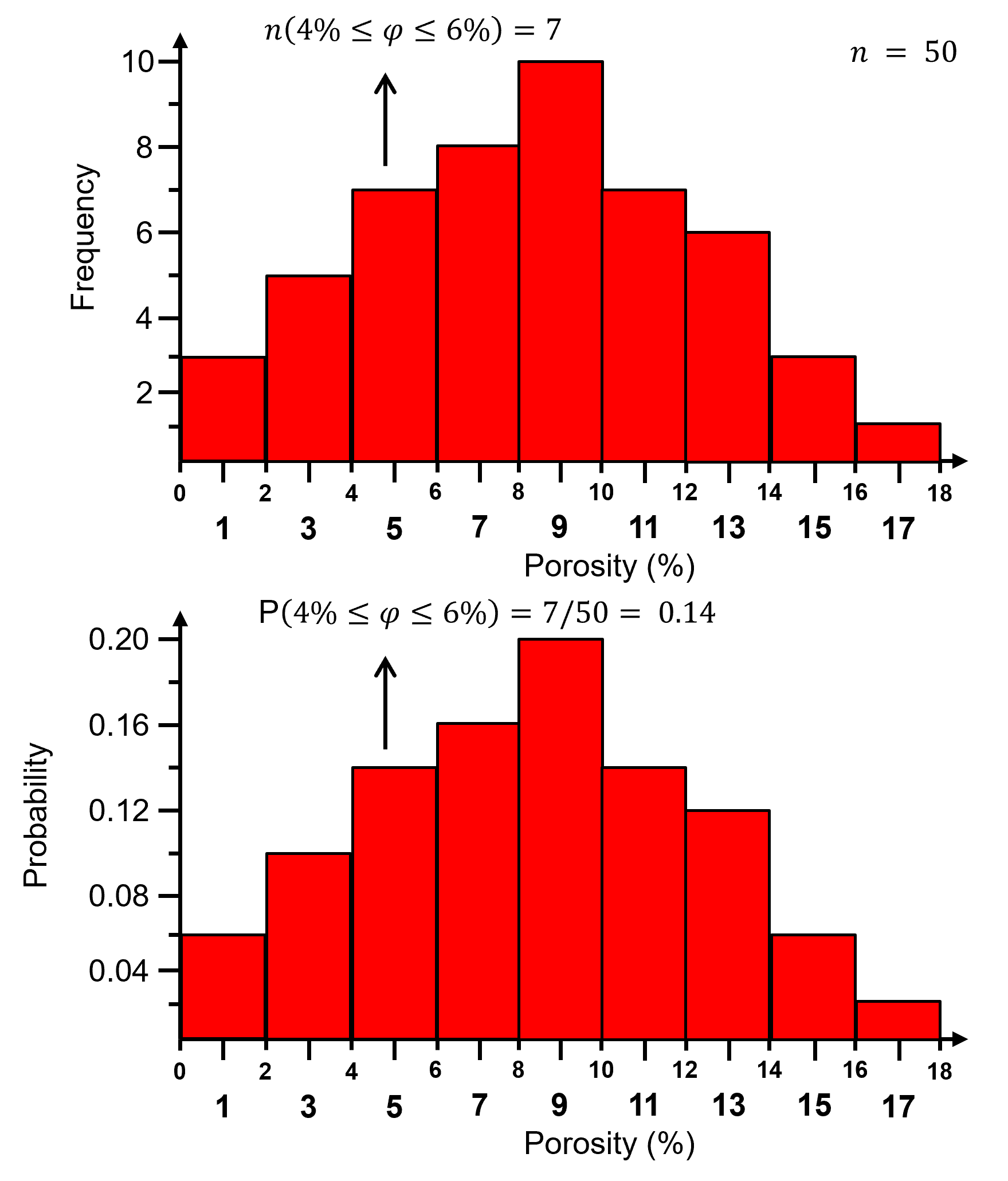
Normalized Histogram#
For a normalized histogram, the frequencies are normalized to the probability by dividing by the total number of samples, \(n\).
the probability that an outcome exists within each bin, 𝑘.
now for each bin we have probability:
and by closure, the sum of all normalized histogram bins is one:
Normalized histogram is convenient because we can read probability from the plot. The steps to calculate a normalized histogram are:
Divide data range (\(x_{max} ‐ x_{min}\)) into desired number bins / classes / categories, \(K\), for continuous features:
Count the number of data in bin, \(n_k\) and then compute the probability where \(n\) is the total number of data.:
Plot bin probability versus mid‐range, \(\left( 𝑥_{𝑘,𝑚𝑖𝑛} + \frac{\Delta x}{2} \right)\) if continuous or the categorical label.
Typically, the bar chart bin width is set to \(\Delta x\) so the bars touch and extend over the entire range from \(𝑥_{𝑘,𝑚𝑖𝑛}\) to \(𝑥_{𝑘,𝑚𝑖𝑛}\) for each bin, \(k\).
Here is the previous histogram and the associated normalized histogram,
Histogram Bin Size#
What is the impact of bin size?
too large bins / too few bins - often smooth out, mask information lack resolution
too small bins / too many bins - are too noisy lack samples in each bin for stable assessment of frequency or probability (if normalized histogram)
The general guidance is to choose the highest resolution with lowest possible noise.
Note: very large and very small bins will tend towards equal proportion in each bin (all samples in a single bin or one sample in each bin).
the distribution may appear to approach a uniform distribution as the bin size approaches extremely too small or too large
Probability Density Function#
Commonly known by its acronym PDF, it is a function, \(𝑓_x(𝑥)\), of probability density across the range of all possible feature values, \(𝑥\), with the following constraints:
non-negativity, note for continuous variables (features) density may be \(> 1.0\)
integrate to calculate probability
closure:
For categorical features, the normalized histogram is the PDF.
Some comments on working with and interpreting the density measure from a probability density function, \(𝒇_x(𝒙)\).
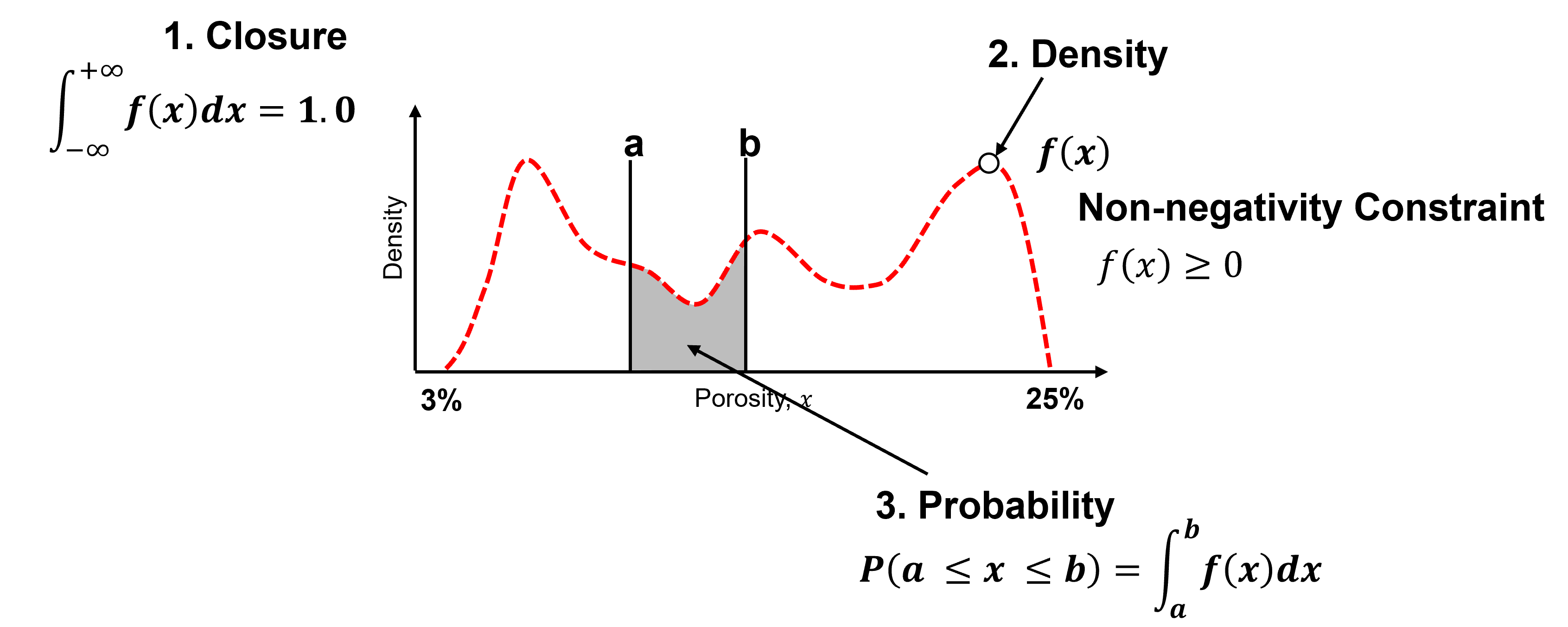
Closure - the area under the curve of a PDF is \(= 1.0\).
Density - is a measure of relative likelihood, may be \(\gt 1.0\), but cannot be negative!
Probability - is only available from the PDF by integration over an interval.
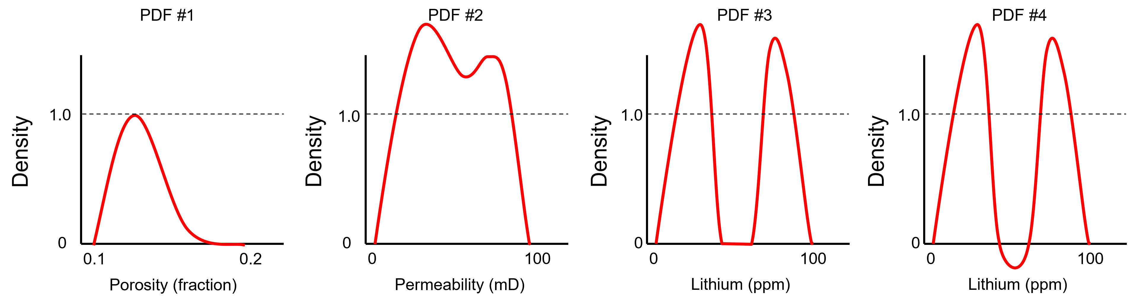
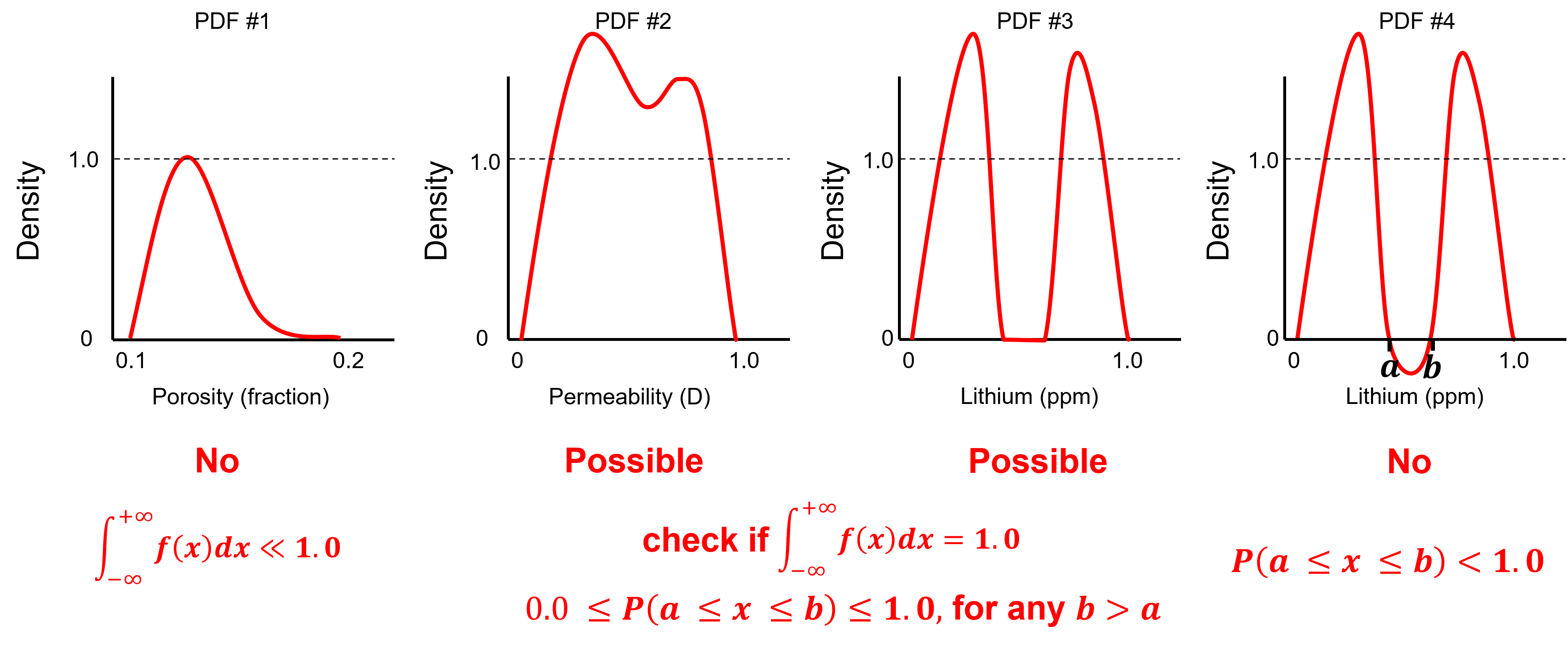
To test you knowledge evaluate these schematic PDFs and determine the ones that are not valid.
Here’s the solutions,
No - a rough estimate of the area under the curve indicates it is well below 1.0, e.g. assuming a triangular shape.
Possible - density can be greater than one as long as all possible intervals [a,b] have a valid probability and the total area under the curve is 1.0 and this look plausible.
Possible - density can be greater than one and density of 0.0 indicates no values in the middle.
No - negative density indicates negative probability over the interval [a,b].
Calculating a PDF#
For parametric cases the PDF’s equation is known, but for the nonparametric case, the PDF is calculated from the data.
While a data-derived, nonparametric PDF could be calculated by differentiating a data-derived CDF (discussed next), generally this would be too noisy!
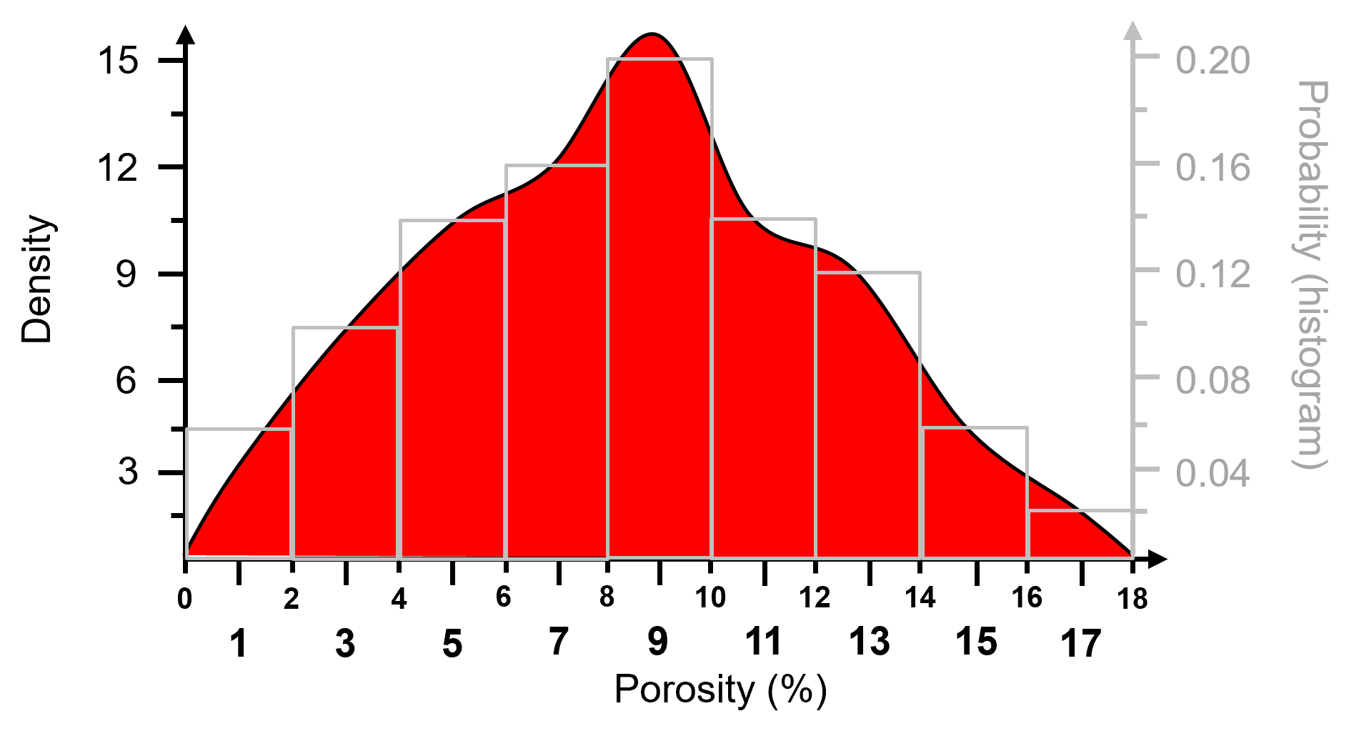
The common method to calculate a data-derived PDF is to fit a smooth model to the data. Kernel Density Estimation (KDE) Approach, fit smooth PDF to data:
Replace all data with a kernel, Gaussian is typical.
Standardize result to ensure closure,
What is the impact of changing the kernel width?
analogous to changing the histogram bin size, attempt to smooth out noise while not removing information
Cumulative Distribution Function#
Commonly known by its acronym CDF, it is the sum of a discrete PDF or the integral of a continuous PDF.
the cumulative distribution function \(𝑭_𝒙 (𝒙)\) is the probability that a random sample, \(𝑿\), is less than or equal to a value \(𝒙\).
CDF is represented as a plot where the x axis is variable (feature) value and the y axis is cumulative probability.
for CDF there is no bin assumption; therefore, graph is at the resolution of the data.
monotonically non-decreasing function, because a negative slope would indicate negative probability over an interval.
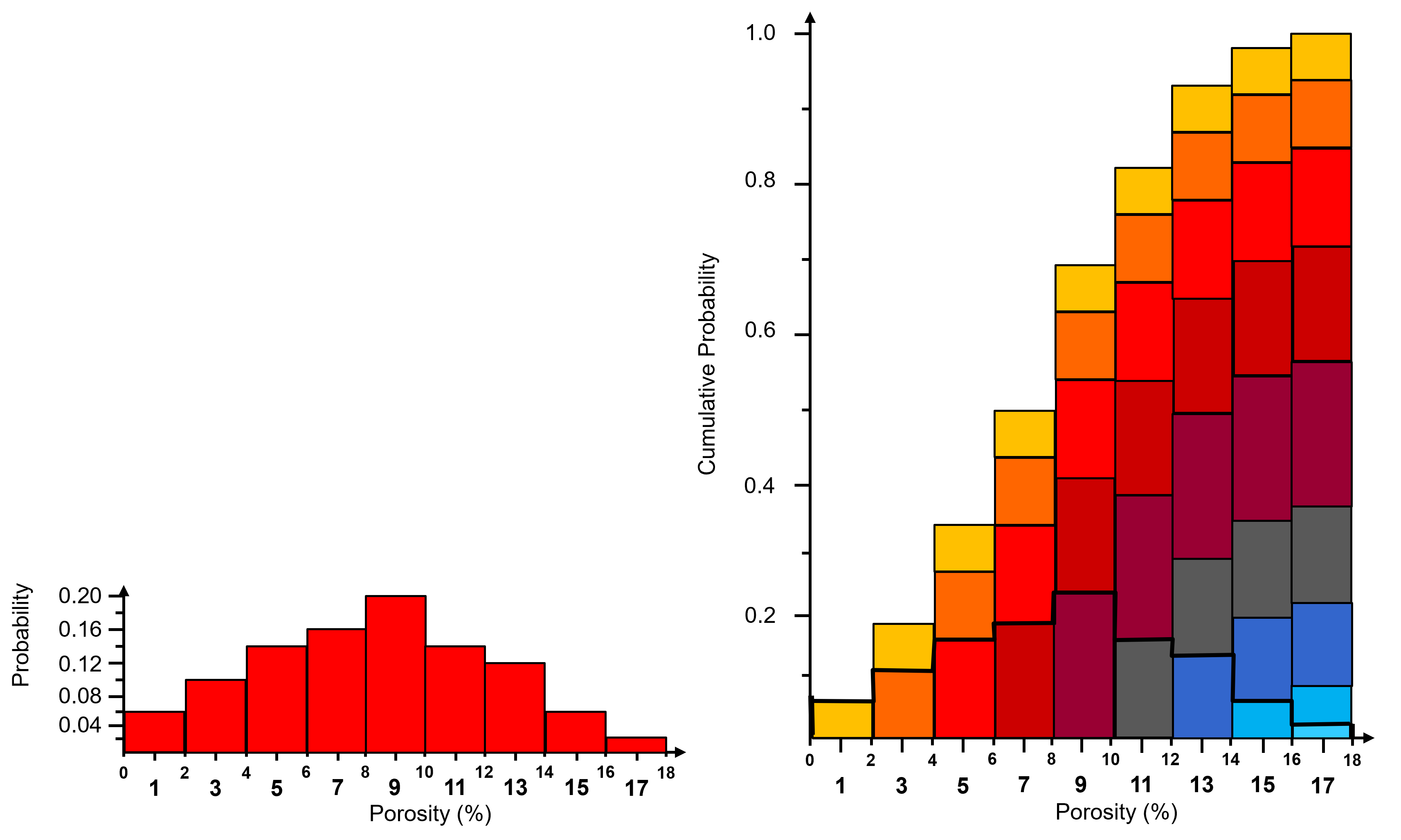
To visualize the CDF, here’s an illustration of the cumulative representation of a normalized histogram.
add the bars to all subsequent bin
this bin-scale CDF, you can calculated these instead of the usual data-scale CDF
Some comments on working with and interpreting the density measure from a cumulative distribution function, \(F_x(𝒙)\).
To check for a valid CDF given these constraints:
non-negativity constraint
valid probability:
cannot have negative slope
minimum and maximum (closure) values:
since the CDF does not have a negative slope we can use limits:
To test you knowledge evaluate these schematic CDFs and determine the ones that are not valid.
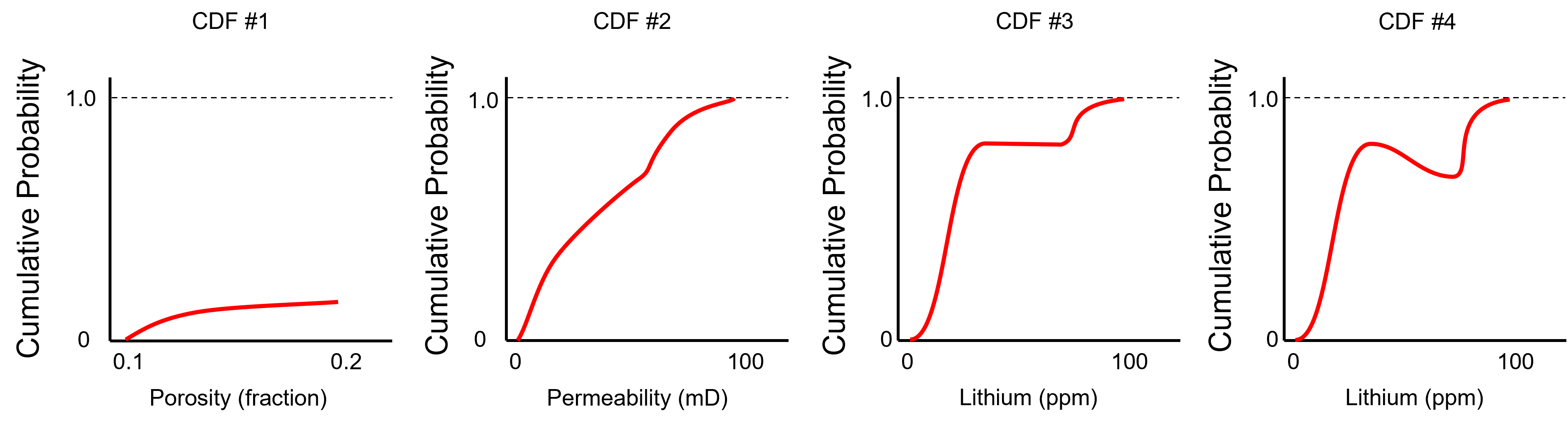
Here’s the solutions,
No - the CDF does not reach 1.0 at the maximum feature value.
Yes - the minimum is 0.0, the maximum is 1.0 and the slope is never negative over the permeability values.
Yes - the minimum is 0.0, the maximum is 1.0 and the slope is never negative over the permeability values. The zero slope interval is a gap in the dataset.
No - negative slope over an interval of lithium values, indicating negative probability.
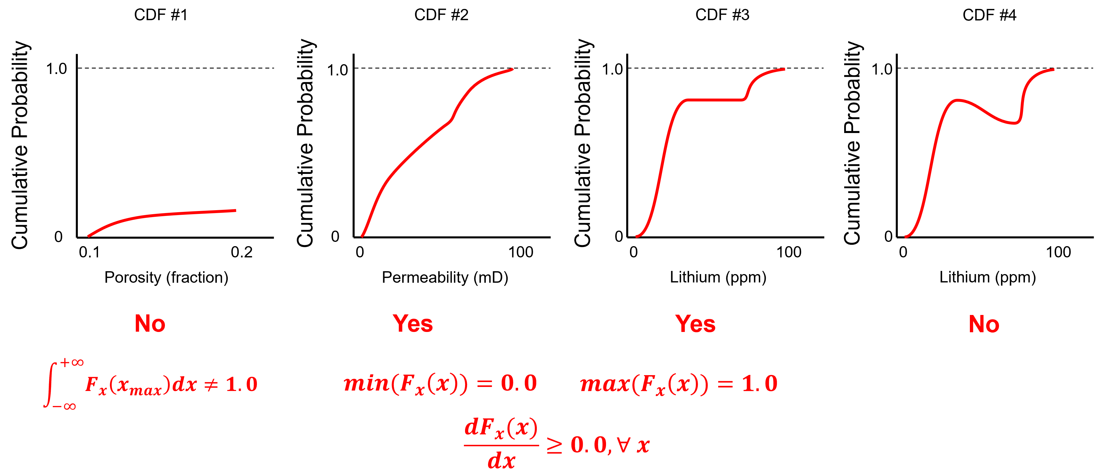
Look carefully, the CDFs above are from the PDFs in the previous example!
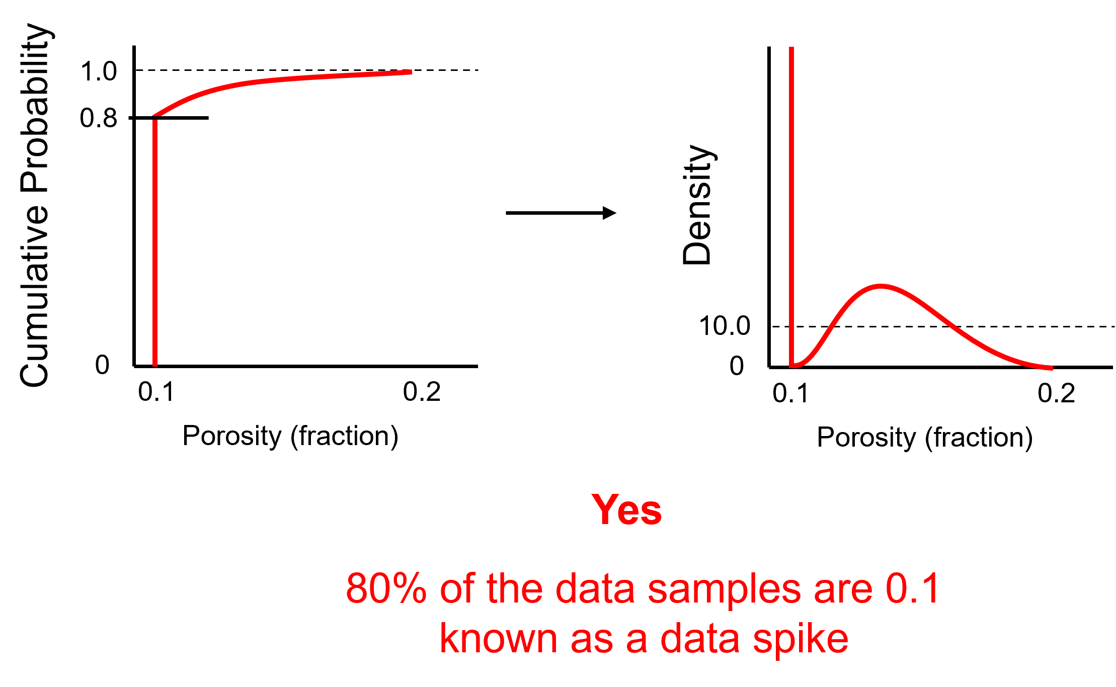
Now let’s challenge ourselves with 1 last example, is this a valid CDF?
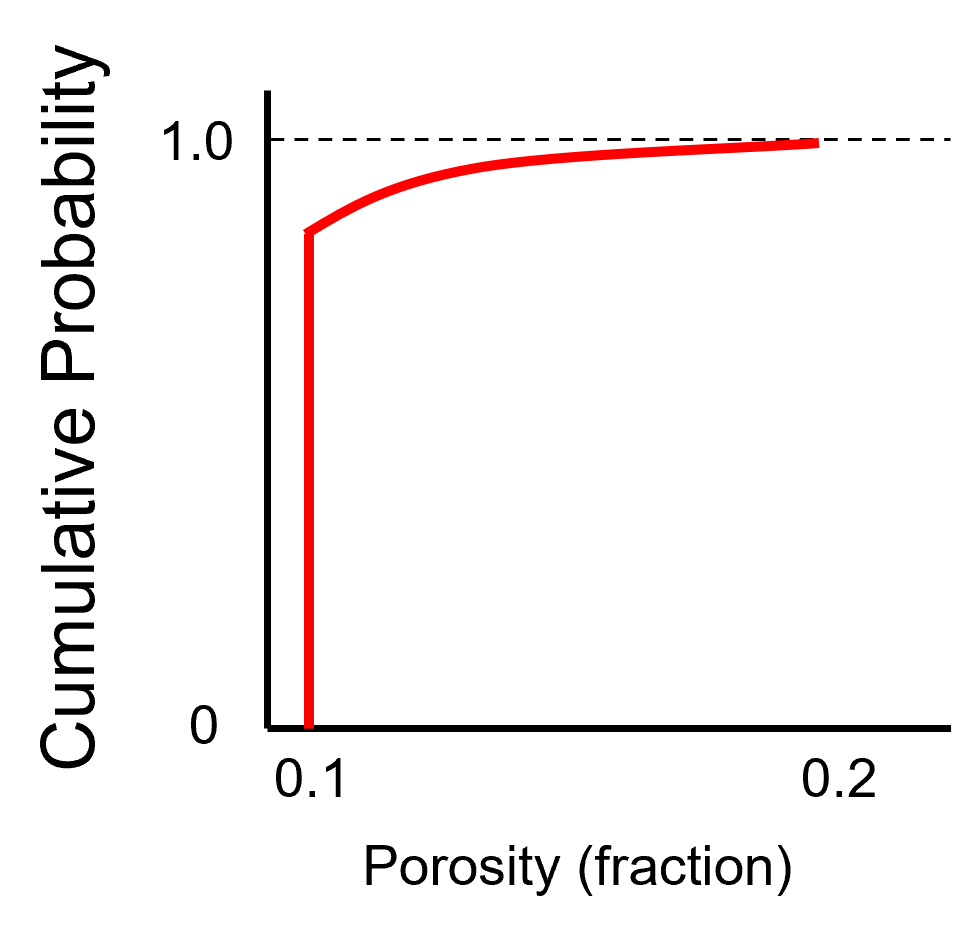
Here’s the solution,
Yes - this is a data spike, 80% of the samples are 0.1 leading to a vertical segment in the CDF that extends for 0.8 cumulative probability.
Random Variable#
Now it is time to introduce the concept of the random variable, since we need this to understand CDF notation above.
Random Variable - we do not know the value at a location / time, it can take on a range of possible values, fully described with a statistical distribution PDF / CDF. It is represented as an upper-case variable, e.g., \(𝑿\), while possible outcomes or data measures are represented with lower case, e.g., \(𝒙\). more latter on this!
Load the Required Libraries#
The following code loads the required libraries.
import geostatspy.GSLIB as GSLIB                              # GSLIB utilities, visualization and wrapper
import geostatspy.geostats as geostats                        # GSLIB methods convert to Python
We will also need some standard packages. These should have been installed with Anaconda 3.
import os                                                     # set working directory, run executables

from tqdm import tqdm                                         # suppress the status bar
from functools import partialmethod
tqdm.__init__ = partialmethod(tqdm.__init__, disable=True)

ignore_warnings = True                                        # ignore warnings?
import numpy as np                                            # ndarrays for gridded data
import pandas as pd                                           # DataFrames for tabular data
import matplotlib.pyplot as plt                               # for plotting
from matplotlib.ticker import (MultipleLocator, AutoMinorLocator) # control of axes ticks
from scipy import stats                                       # summary statistics
import seaborn as sns                                         # advanced plotting
plt.rc('axes', axisbelow=True)                                # plot all grids below the plot elements
if ignore_warnings == True:
    import warnings
    warnings.filterwarnings('ignore')
from IPython.utils import io                                  # mute output from simulation
cmap = plt.cm.inferno                                         # color map
Define Functions#
This is a convenience function to add major and minor gridlines to improve plot interpretability.
def add_grid():
    plt.gca().grid(True, which='major',linewidth = 1.0); plt.gca().grid(True, which='minor',linewidth = 0.2) # add y grids
    plt.gca().tick_params(which='major',length=7); plt.gca().tick_params(which='minor', length=4)
    plt.gca().xaxis.set_minor_locator(AutoMinorLocator()); plt.gca().yaxis.set_minor_locator(AutoMinorLocator()) # turn on minor ticks
Set the Working Directory#
I always like to do this so I don’t lose files and to simplify subsequent read and writes (avoid including the full address each time).
#os.chdir("c:/PGE383") # set the working directory
Loading Tabular Data#
Here’s the command to load our comma delimited data file in to a Pandas’ DataFrame object. For fun try misspelling the name. You will get an ugly, long error.
df = pd.read_csv('sample_data_cow.csv') # load our data table (wrong name!)
---------------------------------------------------------------------------
FileNotFoundError                         Traceback (most recent call last)
Cell In[5], line 1
----> 1 df = pd.read_csv('sample_data_cow.csv')                       # load our data table (wrong name!)

File ~\AppData\Local\anaconda3\envs\book\lib\site-packages\pandas\io\parsers\readers.py:912, in read_csv(filepath_or_buffer, sep, delimiter, header, names, index_col, usecols, dtype, engine, converters, true_values, false_values, skipinitialspace, skiprows, skipfooter, nrows, na_values, keep_default_na, na_filter, verbose, skip_blank_lines, parse_dates, infer_datetime_format, keep_date_col, date_parser, date_format, dayfirst, cache_dates, iterator, chunksize, compression, thousands, decimal, lineterminator, quotechar, quoting, doublequote, escapechar, comment, encoding, encoding_errors, dialect, on_bad_lines, delim_whitespace, low_memory, memory_map, float_precision, storage_options, dtype_backend)
    899 kwds_defaults = _refine_defaults_read(
    900     dialect,
    901     delimiter,
   (...)
    908     dtype_backend=dtype_backend,
    909 )
    910 kwds.update(kwds_defaults)
--> 912 return _read(filepath_or_buffer, kwds)

File ~\AppData\Local\anaconda3\envs\book\lib\site-packages\pandas\io\parsers\readers.py:577, in _read(filepath_or_buffer, kwds)
    574 _validate_names(kwds.get("names", None))
    576 # Create the parser.
--> 577 parser = TextFileReader(filepath_or_buffer, **kwds)
    579 if chunksize or iterator:
    580     return parser

File ~\AppData\Local\anaconda3\envs\book\lib\site-packages\pandas\io\parsers\readers.py:1407, in TextFileReader.__init__(self, f, engine, **kwds)
   1404     self.options["has_index_names"] = kwds["has_index_names"]
   1406 self.handles: IOHandles | None = None
-> 1407 self._engine = self._make_engine(f, self.engine)

File ~\AppData\Local\anaconda3\envs\book\lib\site-packages\pandas\io\parsers\readers.py:1661, in TextFileReader._make_engine(self, f, engine)
   1659     if "b" not in mode:
   1660         mode += "b"
-> 1661 self.handles = get_handle(
   1662     f,
   1663     mode,
   1664     encoding=self.options.get("encoding", None),
   1665     compression=self.options.get("compression", None),
   1666     memory_map=self.options.get("memory_map", False),
   1667     is_text=is_text,
   1668     errors=self.options.get("encoding_errors", "strict"),
   1669     storage_options=self.options.get("storage_options", None),
   1670 )
   1671 assert self.handles is not None
   1672 f = self.handles.handle

File ~\AppData\Local\anaconda3\envs\book\lib\site-packages\pandas\io\common.py:859, in get_handle(path_or_buf, mode, encoding, compression, memory_map, is_text, errors, storage_options)
    854 elif isinstance(handle, str):
    855     # Check whether the filename is to be opened in binary mode.
    856     # Binary mode does not support 'encoding' and 'newline'.
    857     if ioargs.encoding and "b" not in ioargs.mode:
    858         # Encoding
--> 859         handle = open(
    860             handle,
    861             ioargs.mode,
    862             encoding=ioargs.encoding,
    863             errors=errors,
    864             newline="",
    865         )
    866     else:
    867         # Binary mode
    868         handle = open(handle, ioargs.mode)

FileNotFoundError: [Errno 2] No such file or directory: 'sample_data_cow.csv'
That’s Python, but there’s method to the madness. In general the error shows a trace from the initial command into all the nested programs involved until the actual error occurred. If you are debugging code (I know, I’m getting ahead of myself now), this is valuable for the detective work of figuring out what went wrong. I’ve spent days in C++ debugging one issue, this helps. So since you’re working in Jupyter Notebook, the program just assumes you code. Fine. If you scroll to the bottom of the error you often get a summary statement FileNotFoundError: File b’sample_data_cow.csv’ does not exist. Ok, now you know that you don’t have a file with that name in the working directory.
Painful to leave that error in our workflow, eh? Every time I pass it while making this documented I wanted to fix it. Its a coder thing… While we are at it, notice if you click the ‘+’ you can add in a new block anywhere. Ok, let’s spell the file name correctly and get back to work.
df = pd.read_csv('https://raw.githubusercontent.com/GeostatsGuy/GeoDataSets/master/sample_data.csv') # load data from Dr. Pyrcz's github repository
No error now! It worked, we loaded our file into our DataFrame called ‘df’. But how do you really know that it worked? Visualizing the DataFrame is always a good idea as a first order check.
Visualizing the DataFrame#
We can preview the DataFrame by printing a slice or by utilizing the ‘head’ DataFrame member function (with a nice and clean format, see below). With the slice we could look at any subset of the data table and with the head command, add parameter ‘n=13’ to see the first 13 rows of the dataset.
print(df.iloc[0:5,:])                                         # display first 4 samples in the table as a preview
df.head(n=13)                                                 # we could also use this command for a table preview
       X      Y  Facies  Porosity       Perm           AI
0  100.0  900.0     1.0  0.100187   1.363890  5110.699751
1  100.0  800.0     0.0  0.107947  12.576845  4671.458560
2  100.0  700.0     0.0  0.085357   5.984520  6127.548006
3  100.0  600.0     0.0  0.108460   2.446678  5201.637996
4  100.0  500.0     0.0  0.102468   1.952264  3835.270322
| X | Y | Facies | Porosity | Perm | AI | |
|---|---|---|---|---|---|---|
| 0 | 100.0 | 900.0 | 1.0 | 0.100187 | 1.363890 | 5110.699751 |
| 1 | 100.0 | 800.0 | 0.0 | 0.107947 | 12.576845 | 4671.458560 |
| 2 | 100.0 | 700.0 | 0.0 | 0.085357 | 5.984520 | 6127.548006 |
| 3 | 100.0 | 600.0 | 0.0 | 0.108460 | 2.446678 | 5201.637996 |
| 4 | 100.0 | 500.0 | 0.0 | 0.102468 | 1.952264 | 3835.270322 |
| 5 | 100.0 | 400.0 | 0.0 | 0.110579 | 3.691908 | 5295.267191 |
| 6 | 100.0 | 300.0 | 0.0 | 0.088936 | 1.073582 | 6744.996106 |
| 7 | 100.0 | 200.0 | 0.0 | 0.102094 | 2.396189 | 5947.338115 |
| 8 | 100.0 | 100.0 | 1.0 | 0.137453 | 5.727603 | 5823.241783 |
| 9 | 200.0 | 900.0 | 1.0 | 0.137062 | 14.771314 | 5621.146994 |
| 10 | 200.0 | 800.0 | 1.0 | 0.125984 | 10.675436 | 4292.700500 |
| 11 | 200.0 | 700.0 | 0.0 | 0.121754 | 3.085825 | 5397.400218 |
| 12 | 200.0 | 600.0 | 0.0 | 0.095147 | 0.962565 | 4619.786478 |
Summary Univariate Statistics for Tabular Data#
The table includes X and Y coordinates (meters), Facies 1 and 2 (1 is sandstone and 0 interbedded sand and mudstone), Porosity (fraction), permeability as Perm (mDarcy) and acoustic impedance as AI (kg/m2s*10^6).
There are a lot of efficient methods to calculate summary statistics from tabular data in DataFrames. The describe command provides count, mean, minimum, maximum, and quartiles all in a nice data table. We use transpose just to flip the table so that features are on the rows and the statistics are on the columns.
df.describe() # summary statistics
| X | Y | Facies | Porosity | Perm | AI | |
|---|---|---|---|---|---|---|
| count | 261.000000 | 261.000000 | 261.000000 | 261.000000 | 261.000000 | 261.000000 |
| mean | 629.823755 | 488.344828 | 0.620690 | 0.150357 | 183.711554 | 4203.657220 |
| std | 341.200403 | 166.669352 | 0.486148 | 0.049783 | 344.959449 | 1317.753146 |
| min | 40.000000 | 29.000000 | 0.000000 | 0.058871 | 0.033611 | 1844.166880 |
| 25% | 241.000000 | 416.000000 | 0.000000 | 0.104893 | 2.186525 | 2947.867713 |
| 50% | 700.000000 | 479.000000 | 1.000000 | 0.137062 | 19.977020 | 4204.150893 |
| 75% | 955.000000 | 539.000000 | 1.000000 | 0.199108 | 246.215865 | 5397.400218 |
| max | 1005.000000 | 989.000000 | 1.000000 | 0.242298 | 2642.999829 | 7881.898531 |
We can also use a wide variety of statistical summaries built into NumPy’s ndarrays. When we use the command:
df['Porosity']                       # returns an Pandas series
df['Porosity'].values                # returns an ndarray
Panda’s DataFrame returns all the porosity data as a series and if we add ‘values’ it returns a NumPy ndarray and we have access to a lot of NumPy methods. I also like to use the round function to round the answer to a limited number of digits for accurate reporting of precision and ease of reading.
For example, now we could use commands. like this one:
print('The minimum is ' + str(round((df['Porosity'].values).min(),2)) + '.') # print univariate statistics
print('The maximum is ' + str(round((df['Porosity'].values).max(),2)) + '.')
print('The mean is ' + str(round((df['Porosity'].values).mean(),2)) + '.')
print('The standard deviation is ' + str(round((df['Porosity'].values).std(),2)) + '.')
The minimum is 0.06.
The maximum is 0.24.
The mean is 0.15.
The standard deviation is 0.05.
Here’s some of the NumPy statistical functions that take ndarrays as an inputs. With these methods if you had a multidimensional array you could calculate the average by row (axis = 1) or by column (axis = 0) or over the entire array (no axis specified). We just have a 1D ndarray so this is not applicable here.
We calculate the inverse of the CDF, \(F^{-1}_x(x)\) with Numpy percentile function.
print('The minimum is ' + str(round(np.amin(df['Porosity'].values),2))) # print univariate statistics
print('The maximum is ' + str(round(np.amax(df['Porosity'].values),2)))
print('The range (maximum - minimum) is ' + str(round(np.ptp(df['Porosity'].values),2)))
print('The P10 is ' + str(round(np.percentile(df['Porosity'].values,10),3)))
print('The P50 is ' + str(round(np.percentile(df['Porosity'].values,50),3)))
print('The P90 is ' + str(round(np.percentile(df['Porosity'].values,90),3)))
print('The P13 is ' + str(round(np.percentile(df['Porosity'].values,13),3)))
print('The median (P50) is ' + str(round(np.median(df['Porosity'].values),3)))
print('The mean is ' + str(round(np.mean(df['Porosity'].values),3)))
The minimum is 0.06
The maximum is 0.24
The range (maximum - minimum) is 0.18
The P10 is 0.092
The P50 is 0.137
The P90 is 0.212
The P13 is 0.095
The median (P50) is 0.137
The mean is 0.15
We can calculate the CDF value, \(F_x(x)\), directly from the data.
we apply a conditional statement to our ndarray to calculate a boolean ndarray with the same size of the data and then count the cases that meet the condition
note, we are assuming equal weighting
value = 0.10                                                  # calculate cumulative distribution function for a specified value
cumul_prob = np.count_nonzero(df['Porosity'].values <= value)/len(df)
print('The cumulative probability for porosity = ' + str(value) + ' is ' + str(round(cumul_prob,2)))
The cumulative probability for porosity = 0.1 is 0.18
Weighted Univariate Statistics#
In the declustering chapters I present methods to calculate weights and the motivation for weighted statistics.
The NumPy command average allows for weighted averages as in the case of statistical expectation and declustered statistics.
For demonstration, lets make a weighting array and apply it.
nd = len(df)                                                  # get the number of data values
wts = np.ones(nd)                                             # make an array of nd length of 1's
print('The equal weighted average is ' + str(round(np.average(df['Porosity'].values,weights = wts),3)) + ', the same as the mean above.')
The equal weighted average is 0.15, the same as the mean above.
Let’s get fancy, we will modify the weights to be 0.5 if the porosity is greater than 13% and retain 1.0 if the porosity is less than or equal to 13%. The results should be a lower weighted average.
porosity = df['Porosity'].values
wts[porosity > 0.13] *= 0.1                                   # make arbitrary weights for demonstration
print('The equal weighted average is ' + str(round(np.average(df['Porosity'].values,weights = wts),3)) + ', lower than the equal weighted average above.')
The equal weighted average is 0.112, lower than the equal weighted average above.
I should note that SciPy stats functions provide a handy summary statistics function. The output is a ‘list’ of values (actually it is a SciPy.DescribeResult object). One can extract any one of them to use in a workflow as follows.
print(stats.describe(df['Porosity'].values))                  # summary statistics
por_stats = stats.describe(df['Porosity'].values)             # store as an array
print('Porosity kurtosis is ' + str(round(por_stats[5],2)))   # extract a statistic
DescribeResult(nobs=np.int64(261), minmax=(np.float64(0.0588710426408954), np.float64(0.2422978845362023)), mean=np.float64(0.15035706160196555), variance=np.float64(0.0024783238419715933), skewness=np.float64(0.08071652694567066), kurtosis=np.float64(-1.5618166076333853))
Porosity kurtosis is -1.56
Histograms#
Let’s display some histograms. I reimplemented the hist function from GSLIB. Preview the parameters by typing the command without parameters.
also to learn about function parameters the alt-tab key combination with cursor in the function parentheses is often available to access the “docstrings” or check the Python package docs.
GSLIB.hist
<function geostatspy.GSLIB.hist(array, xmin, xmax, log, cumul, bins, weights, xlabel, title, fig_name)>
Let’s make a histogram for the porosity feature.
pormin = 0.05; pormax = 0.25                                  # minimum and maximum feature values
GSLIB.hist_st(df['Porosity'].values,pormin,pormax,log=False,cumul = False,bins=10,weights = None,
           xlabel='Porosity (fraction)',title='Porosity Well Data')
add_grid()
plt.subplots_adjust(left=0.0, bottom=0.0, right=1.0, top=1.1, wspace=0.1, hspace=0.2); plt.show()
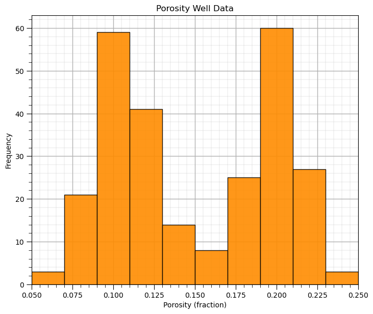
What’s going on here? Looks quite bimodal.
Histogram Bins, Number of Bins and Bin Size#
Let’s explore with a few bins sizes to check the impact on the histogram.
nbin_list = [3,20,100]                                             # number of bins for each histogram

for i,nbin in enumerate(nbin_list):
    plt.subplot(3,1,i+1)
    GSLIB.hist_st(df['Porosity'].values,pormin,pormax,log=False,cumul = False,bins=nbin,weights = None,
                  xlabel='Porosity (fraction)',title='Histogram with ' + str(nbin) + ' Bins'); add_grid()

plt.subplots_adjust(left=0.0, bottom=0.0, right=1.0, top=3.1, wspace=0.2, hspace=0.2); plt.show()
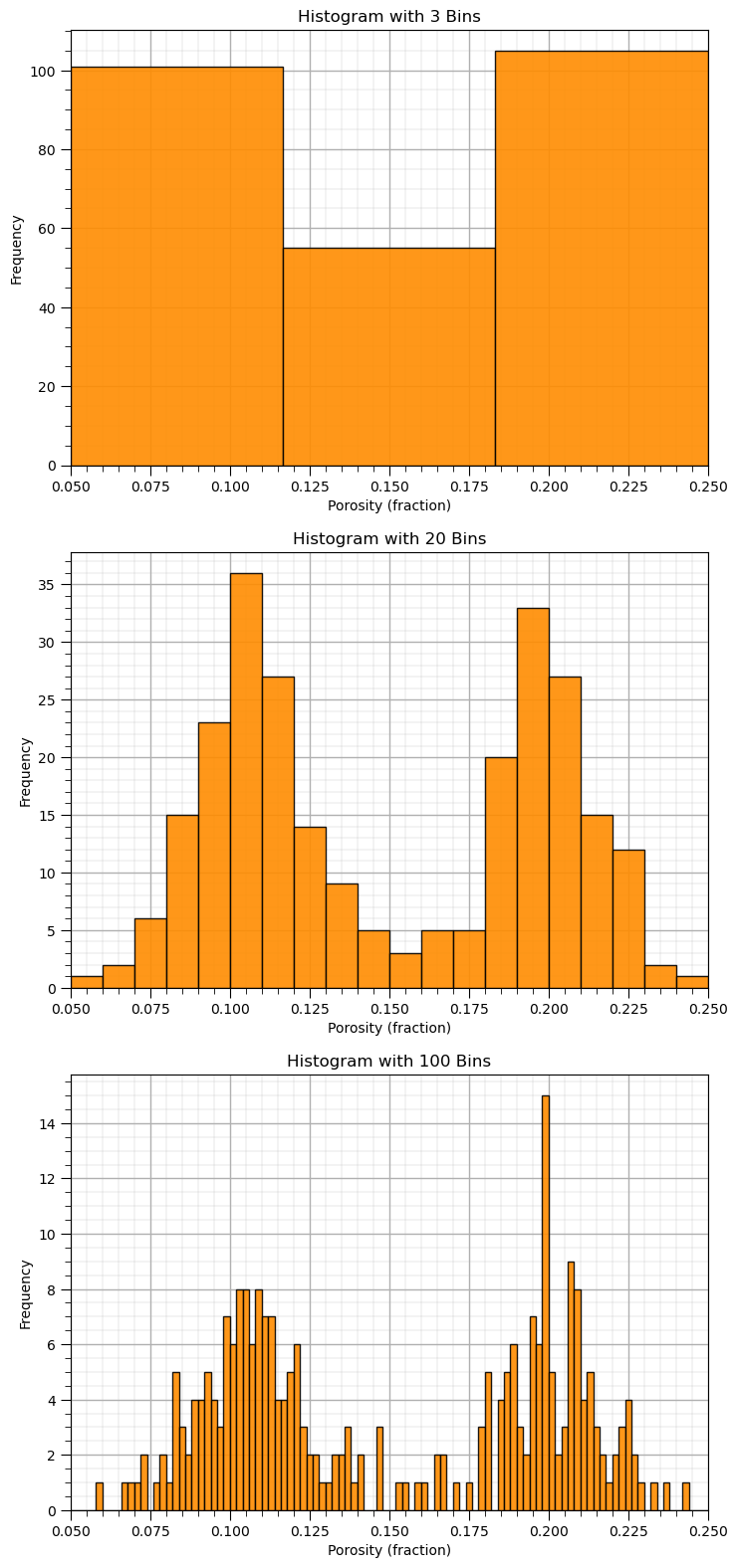
See what happens when we use:
too large bins / too few bins - often smooth out, removes information
too small bins / too many bins - often too noisy, obscures information
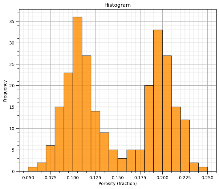
Plotting a Histogram with the matplotlib Package#
I don’t want to suggest that matplotlib is hard to use. The GSLIB visualizations provide convenience and once again use the same parameters as the GSLIB methods. Particularly, the ‘hist’ function is pretty easy to use, just a lot more code to write.
here’s how we can make the same histogram as above with matplotlib directly
plt.hist(df['Porosity'].values,alpha=0.8,color="darkorange",edgecolor="black",bins=20,range=[pormin,pormax])
plt.title('Histogram'); plt.xlabel('Porosity (fraction)'); plt.ylabel("Frequency"); add_grid()
plt.subplots_adjust(left=0.0, bottom=0.0, right=1.0, top=1.1, wspace=0.1, hspace=0.2); plt.show()
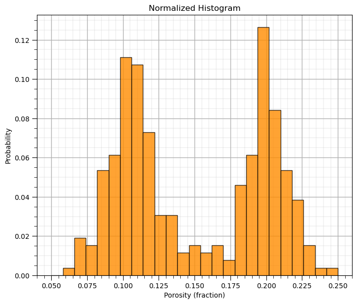
Now we can demonstrate normalized histograms with matplotlib.
I didn’t add this functionality to GeostatsPy’s hist function
Normalized Histograms#
Normalized histograms are convenient since we can read probability to be in each bin and observe closure by summing the probability for all bins is 1.0.
to do this we need to explicitly set the weight for each data as \(\frac{1}{n}\) (assuming equal weighting)
weights = np.ones(len(df)) / len(df)
plt.hist(df['Porosity'].values,alpha=0.8,color="darkorange",edgecolor="black",bins=25,range=[pormin,pormax],weights=weights)
plt.title('Normalized Histogram'); plt.xlabel('Porosity (fraction)'); plt.ylabel("Probability"); add_grid()
plt.subplots_adjust(left=0.0, bottom=0.0, right=1.0, top=1.1, wspace=0.1, hspace=0.2); plt.show()
Probability Density Functions#
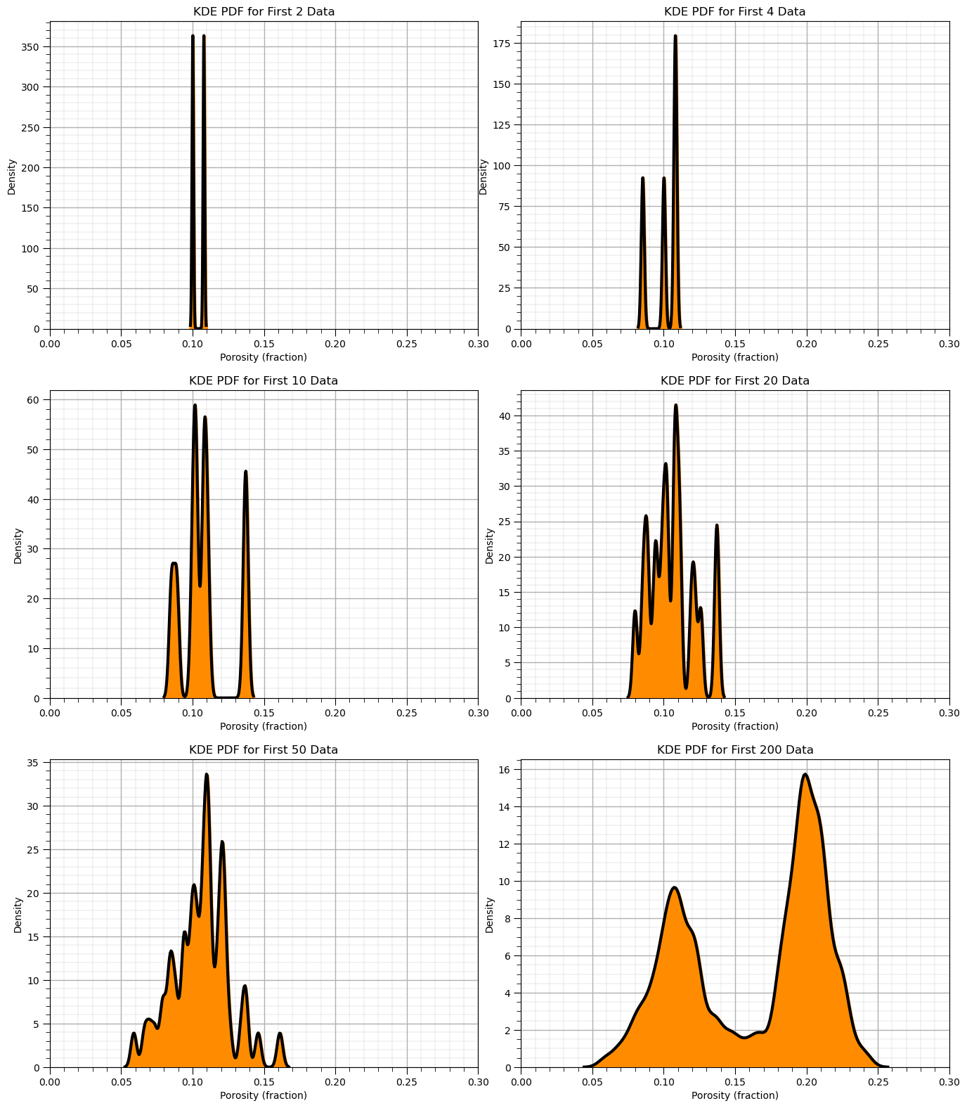
The practical way to calculate a probability density function (PDF) from data is to use of kernel density estimate (KDE).
we place a kernel, in this case a parametric Gaussian PDF, at each data value and then calculate the sum of all data kernels.
constrained for closure such that the area under the curve is 1.0.
differentiating the data CDF is usually too noisy to be useful.
To demonstrate the KDE method, we calculate the KDE PDF for the first 2, 5, …, 200 data.
when there are very few data you can see the individual Gaussian kernels
with more data they start to smooth out
nums=[2,4,10,20,50,200]

for i, num in enumerate(nums):
    plt.subplot(3,2,i+1)
    sns.kdeplot(x=df['Porosity'].values[:num],color = 'black',alpha = 1.0,linewidth=3,bw_method=0.1,fill=False,zorder=10)
    sns.kdeplot(x=df['Porosity'].values[:num],color = 'darkorange',alpha = 1.0,linewidth=3,bw_method=0.1,fill=True,zorder=1)
    plt.xlim([0,0.30]); add_grid()
    plt.title('KDE PDF for First ' + str(num) + ' Data'); plt.xlabel('Porosity (fraction)'); plt.ylabel("Density")
plt.subplots_adjust(left=0.0, bottom=0.0, right=2.0, top=3.1, wspace=0.1, hspace=0.2); plt.show()
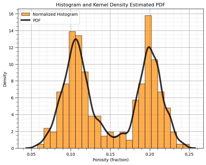
Now we can use the Seaborn Python package to calculate and plot the PDF from our data.
plt.hist(df['Porosity'].values,alpha=0.7,color="darkorange",edgecolor="black",bins=25,range=[pormin,pormax],density=True,
         label = 'Normalized Histogram')
sns.kdeplot(x=df['Porosity'].values,color = 'black',alpha = 0.8,linewidth=4.0,bw_method=0.10,label = 'PDF')
plt.title('Histogram and Kernel Density Estimated PDF'); plt.xlabel('Porosity (fraction)'); plt.ylabel("Density")
plt.legend(loc='upper left'); add_grid()
plt.subplots_adjust(left=0.0, bottom=0.0, right=1.0, top=1.0, wspace=0.1, hspace=0.2); plt.show()
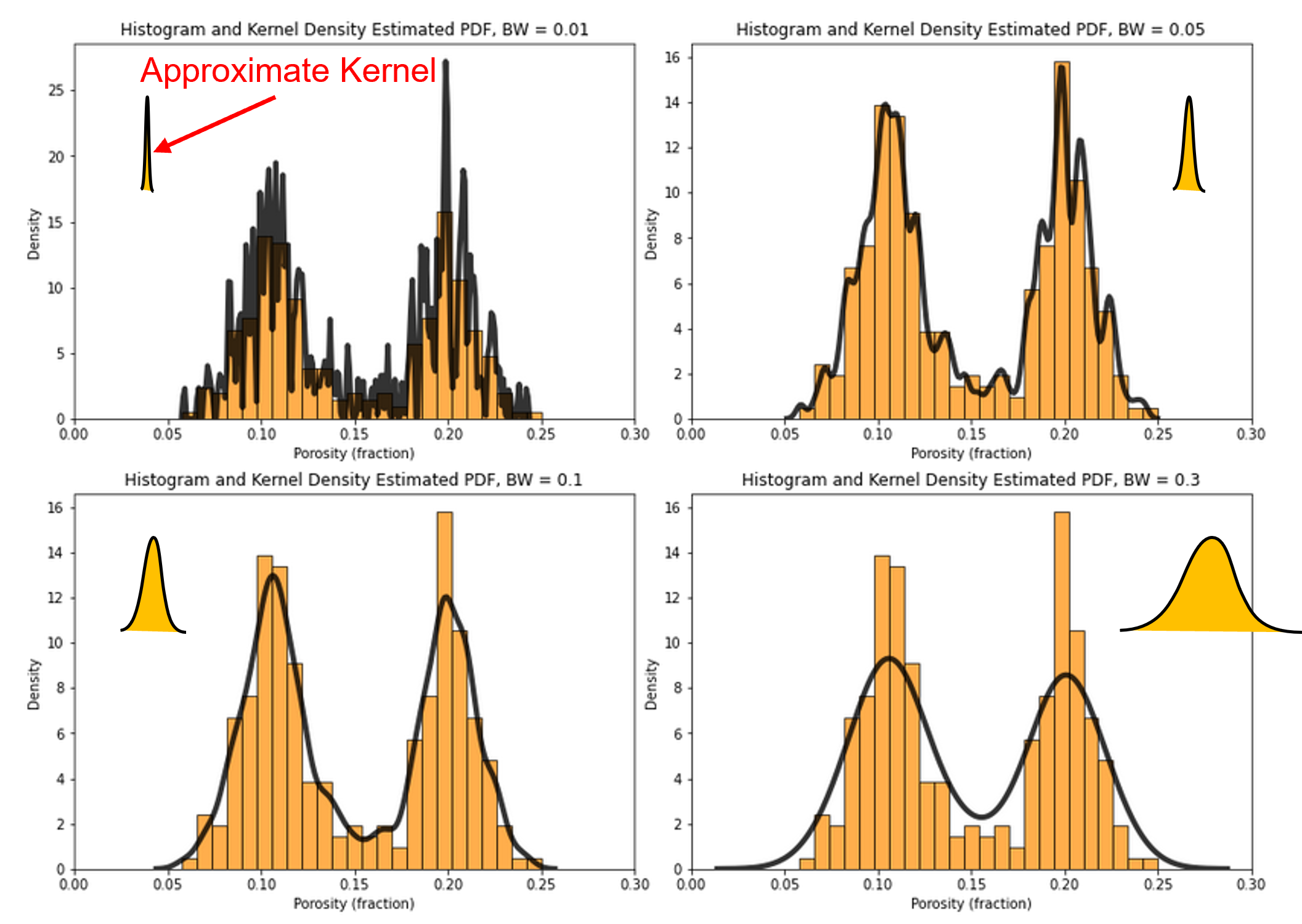
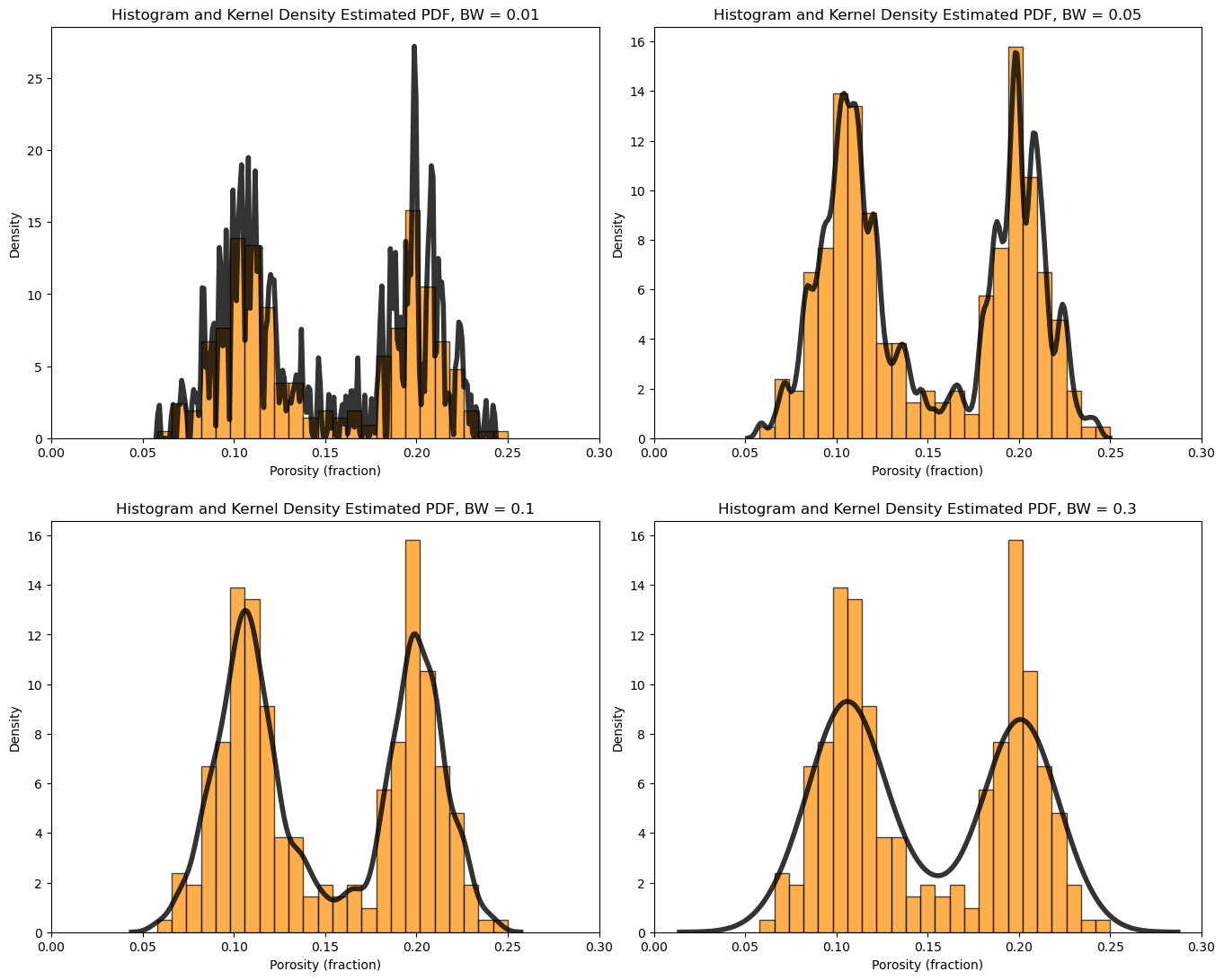
What is the impact of changing the kernel width on the KDE PDF model?
let’s loop over a variety of kernel sizes and observe the resulting PDF with the data histogram.
note, kernel width is controlled by bandwidth, but the bandwidth parameter is poorly documented in Seaborn and seems to be related to original standard deviation. My hypothesis is the kernel standard deviation is the product of the bandwidth and the standard deviation of the feature.
for i, bw in enumerate([0.01,0.05,0.1,0.3]):
    plt.subplot(2,2,i+1)
    print(r'Band Width = ' + str(bw) + r', bandwidth x standard deviation = ' + str(bw*np.std(df['Porosity'])) )
    plt.hist(df['Porosity'].values,alpha=0.7,color="darkorange",edgecolor="black",bins=25,range=[pormin,pormax],density=True)
    sns.kdeplot(x=df['Porosity'].values,color = 'black',alpha = 0.8,linewidth=4.0,bw_method=bw)
    plt.xlim([0.0,0.3])
    plt.title('Histogram and Kernel Density Estimated PDF, BW = ' + str(bw)); plt.xlabel('Porosity (fraction)'); plt.ylabel("Density")

plt.subplots_adjust(left=0.0, bottom=0.0, right=2.0, top=2.1, wspace=0.1, hspace=0.2); plt.show()
Band Width = 0.01, bandwidth x standard deviation = 0.0004968730570602708
Band Width = 0.05, bandwidth x standard deviation = 0.0024843652853013543
Band Width = 0.1, bandwidth x standard deviation = 0.0049687305706027085
Band Width = 0.3, bandwidth x standard deviation = 0.014906191711808122
Cumulative Distribution Functions#
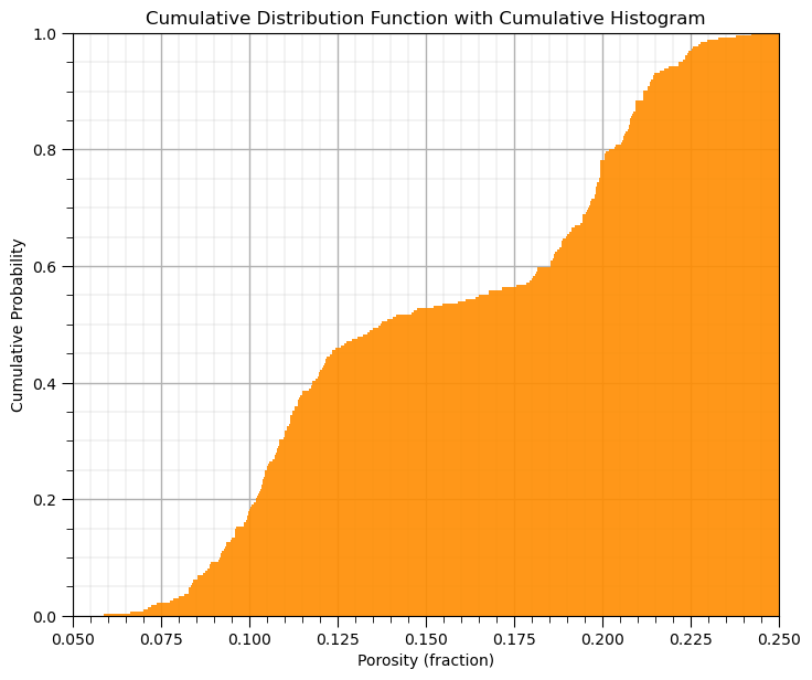
This method in GeostatsPy makes a cumulative histogram.
you could increase or decrease the number of bins, \(> n\) is data resolution
GSLIB.hist_st(df['Porosity'].values,pormin,pormax,log=False,cumul = True,bins=1000,weights = None, # CDF with GeostatsPy
           xlabel='Porosity (fraction)',title='Cumulative Distribution Function with Cumulative Histogram'); add_grid()
plt.subplots_adjust(left=0.0, bottom=0.0, right=1.0, top=1.1, wspace=0.1, hspace=0.2); plt.show()
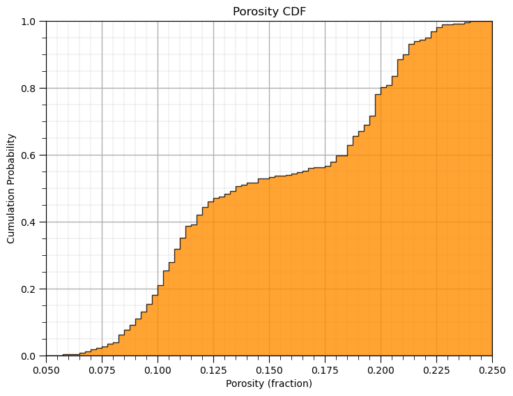
Plotting a CDF with the Matplotlib Package#
Here’s how we calculate and plot a CDF with matplotlib.
the y axis is cumulative probability with a minimum of 0.0 and maximum of 1.0 as expected for a CDF.
note after the initial hist command we can add a variety of elements such as labels to our plot as shown below.
plt.hist(df['Porosity'].values,density=True, cumulative=True, label='CDF',
           histtype='stepfilled', alpha=0.8, bins = 100, color='darkorange', edgecolor = 'black', range=[0.0,0.25])
plt.xlabel('Porosity (fraction)'); plt.title('Porosity CDF'); plt.ylabel('Cumulation Probability'); add_grid()
plt.subplots_adjust(left=0.0, bottom=0.0, right=1.0, top=1.0, wspace=0.1, hspace=0.2); plt.xlim([pormin,pormax]); plt.ylim([0,1])
#plt.savefig('cdf_Porosity.tif',dpi=600,bbox_inches="tight")
plt.show()
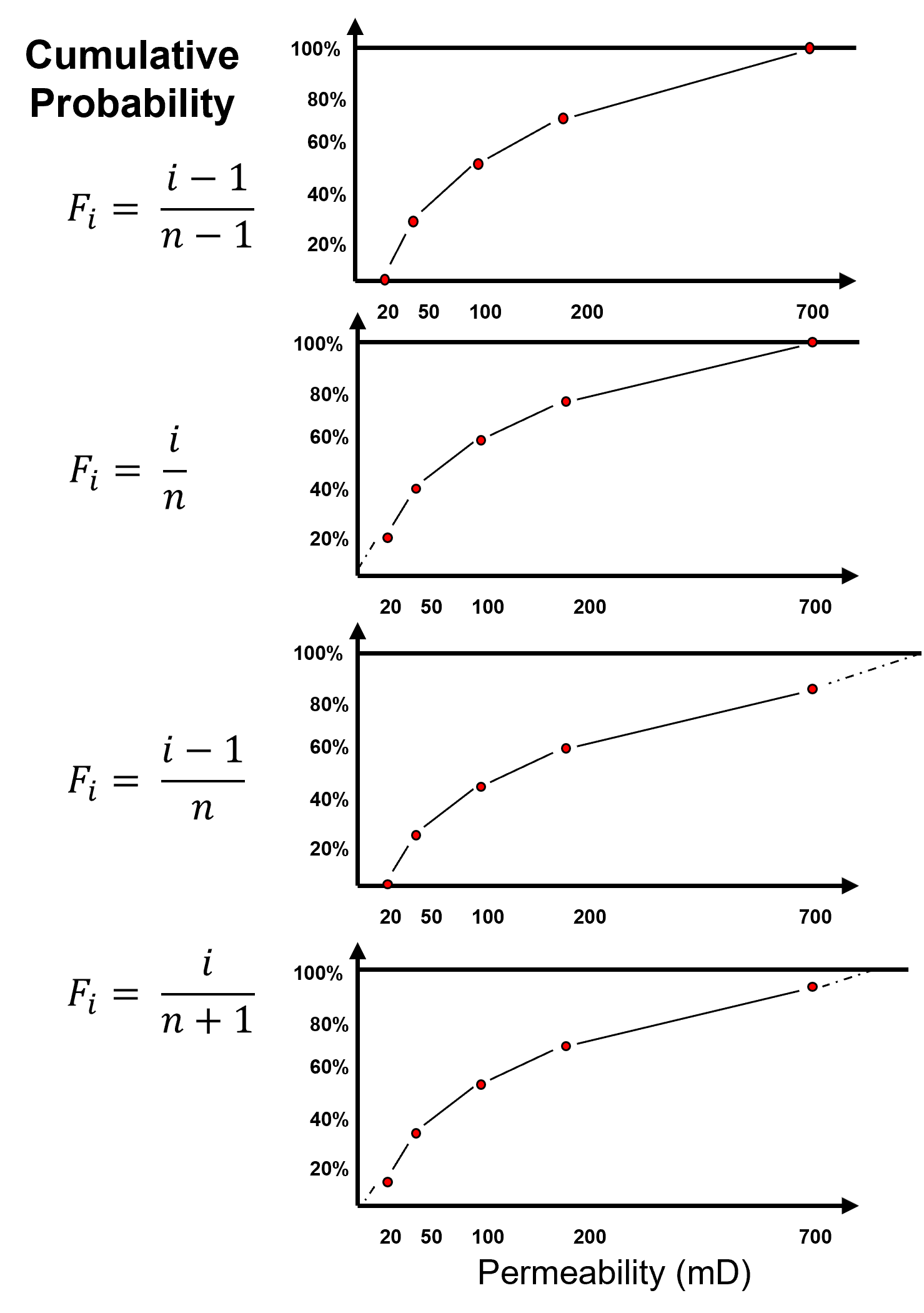
Calculating and Plotting a CDF ‘by- Hand’#
Let’s demonstrate the calculation and plotting of a non-parametric CDF by hand
make a copy of the feature as a 1D array (ndarray from NumPy)
sort the data in ascending order
assign cumulative probabilities based on the tail assumptions
plot cumulative probability vs. feature value
While assigning the cumulative probabilities you must make an assumption about the distribution tails (minimum and maximum values).
known tail - the minimum or maximum value in the dataset is the minimum or maximum value of the distribution
unknown tail - the minimum or maximum value of the distribution is known
For each possible case we calculate cumulative probability of the sorted in ascending order data as,
known lower and upper tail,
unknown lower and known upper tail,
known lower and unknown upper tail,
unknown upper and lower tail,
this is more important with sparsely sampled datasets. When \(n\) is large this is not as important,
the range of cumulative probability at the tails is very small!
the minimum and maximum of the feature may be well-known
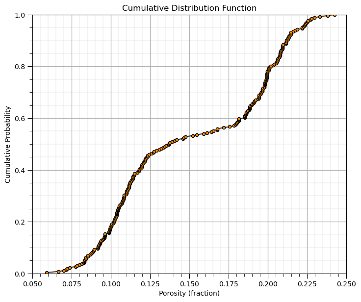
Let’s visualize these cases,
por = df['Porosity'].copy(deep = True).values                 # make a deep copy of the feature from the DataFrame
print('The ndarray has a shape of ' + str(por.shape) + '.')

por = np.sort(por)                                            # sort the data in ascending order
n = por.shape[0]                                              # get the number of data samples
cprob = np.zeros(n)
for i in range(0,n):
    index = i + 1
    cprob[i] = index / n                                      # known upper tail
    # cprob[i] = (index - 1)/n                                # known lower tail
    # cprob[i] = (index - 1)/(n - 1)                          # known upper and lower tails
    # cprob[i] = index/(n+1)                                  # unknown tails

plt.subplot(111)
plt.plot(por,cprob, alpha = 0.8, c = 'black',zorder=1) # plot piecewise linear interpolation
plt.scatter(por,cprob,s = 20, alpha = 1.0, c = 'darkorange', edgecolor = 'black',zorder=2) # plot the CDF points
plt.xlim([pormin,pormax]); plt.ylim([0.0,1.0]); add_grid()
plt.xlabel("Porosity (fraction)"); plt.ylabel("Cumulative Probability"); plt.title("Cumulative Distribution Function")

plt.subplots_adjust(left=0.0, bottom=0.0, right=1.0, top=1.1, wspace=0.1, hspace=0.2); plt.show()
The ndarray has a shape of (261,).
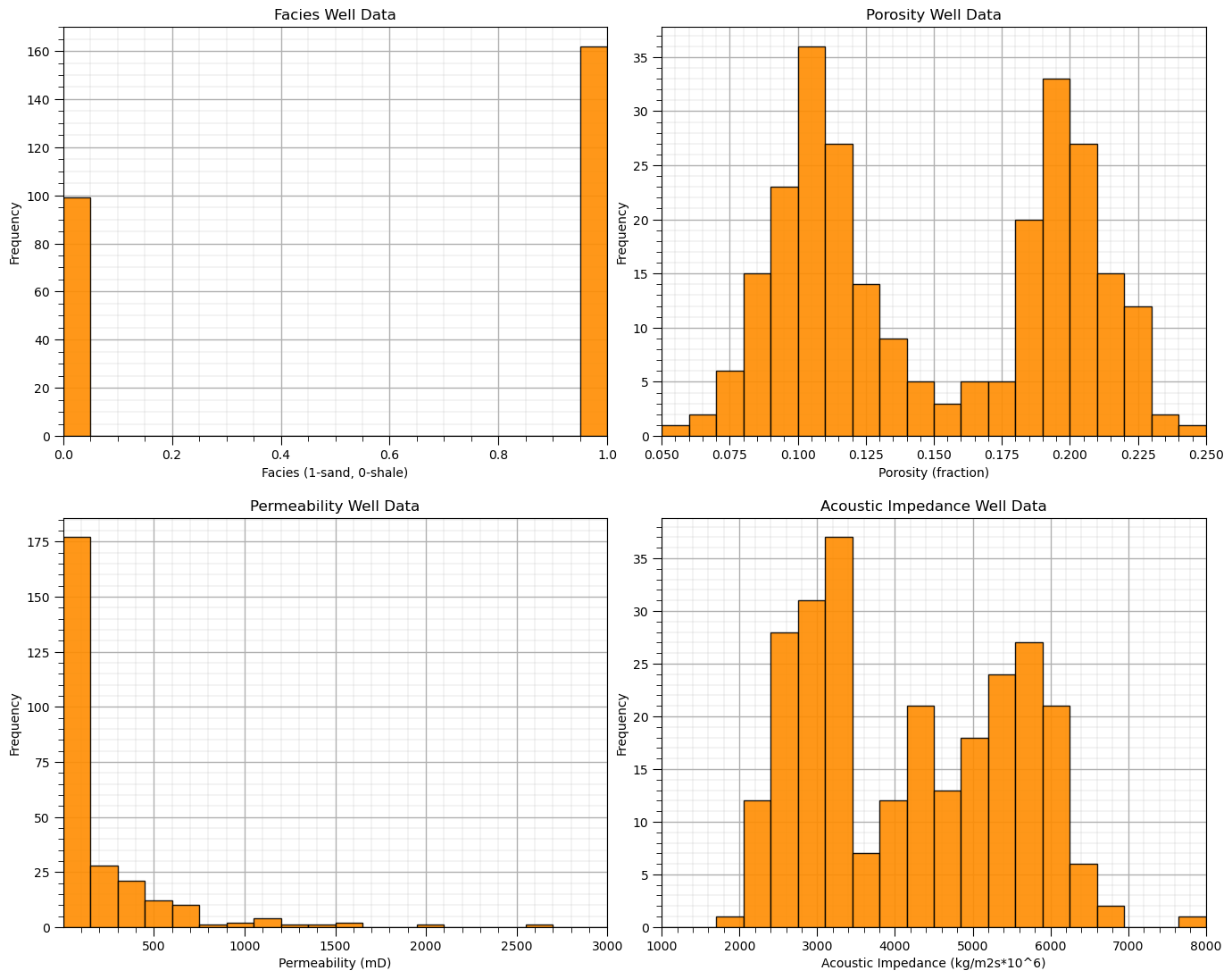
In conclusion, let’s finish with the histograms of all of our features!
permmin = 0.01; permmax = 3000;                # user specified min and max
AImin = 1000.0; AImax = 8000
Fmin = 0; Fmax = 1

plt.subplot(221)
GSLIB.hist_st(df['Facies'].values,Fmin,Fmax,log=False,cumul = False,bins=20,weights = None,xlabel='Facies (1-sand, 0-shale)',
              title='Facies Well Data'); add_grid()

plt.subplot(222)
GSLIB.hist_st(df['Porosity'].values,pormin,pormax,log=False,cumul = False,bins=20,weights = None,xlabel='Porosity (fraction)',
              title='Porosity Well Data'); add_grid()

plt.subplot(223)
GSLIB.hist_st(df['Perm'].values,permmin,permmax,log=False,cumul = False,bins=20,weights = None,xlabel='Permeability (mD)',
              title='Permeability Well Data'); add_grid()

plt.subplot(224)
GSLIB.hist_st(df['AI'].values,AImin,AImax,log=False,cumul = False,bins=20,weights = None,xlabel='Acoustic Impedance (kg/m2s*10^6)',
              title='Acoustic Impedance Well Data'); add_grid()

plt.subplots_adjust(left=0.0, bottom=0.0, right=2.0, top=2.1, wspace=0.1, hspace=0.2)
#plt.savefig('hist_Porosity_Multiple_bins.tif',dpi=600,bbox_inches="tight")
plt.show()
About the Author#

Michael Pyrcz is a professor in the Cockrell School of Engineering, and the Jackson School of Geosciences, at The University of Texas at Austin, where he researches and teaches subsurface, spatial data analytics, geostatistics, and machine learning. Michael is also,
the principal investigator of the Energy Analytics freshmen research initiative and a core faculty in the Machine Learn Laboratory in the College of Natural Sciences, The University of Texas at Austin
an associate editor for Computers and Geosciences, and a board member for Mathematical Geosciences, the International Association for Mathematical Geosciences.
Michael has written over 70 peer-reviewed publications, a Python package for spatial data analytics, co-authored a textbook on spatial data analytics, Geostatistical Reservoir Modeling and author of two recently released e-books, Applied Geostatistics in Python: a Hands-on Guide with GeostatsPy and Applied Machine Learning in Python: a Hands-on Guide with Code.
All of Michael’s university lectures are available on his YouTube Channel with links to 100s of Python interactive dashboards and well-documented workflows in over 40 repositories on his GitHub account, to support any interested students and working professionals with evergreen content. To find out more about Michael’s work and shared educational resources visit his Website.
Want to Work Together?#
I hope this content is helpful to those that want to learn more about subsurface modeling, data analytics and machine learning. Students and working professionals are welcome to participate.
Want to invite me to visit your company for training, mentoring, project review, workflow design and / or consulting? I’d be happy to drop by and work with you!
Interested in partnering, supporting my graduate student research or my Subsurface Data Analytics and Machine Learning consortium (co-PI is Professor John Foster)? My research combines data analytics, stochastic modeling and machine learning theory with practice to develop novel methods and workflows to add value. We are solving challenging subsurface problems!
I can be reached at mpyrcz@austin.utexas.edu.
I’m always happy to discuss,
Michael
Michael Pyrcz, Ph.D., P.Eng. Professor, Cockrell School of Engineering and The Jackson School of Geosciences, The University of Texas at Austin
More Resources Available at: Twitter | GitHub | Website | GoogleScholar | Geostatistics Book | YouTube | Applied Geostats in Python e-book | Applied Machine Learning in Python e-book | LinkedIn
Comments#
This was a basic demonstration of distribution transformations with GeostatsPy. Much more can be done, I have other demonstrations for modeling workflows with GeostatsPy in the GitHub repository GeostatsPy_Demos.
I hope this is helpful,
Michael