
QQ-Plots#
Michael J. Pyrcz, Professor, The University of Texas at Austin
Twitter | GitHub | Website | GoogleScholar | Geostatistics Book | YouTube | Applied Geostats in Python e-book | Applied Machine Learning in Python e-book | LinkedIn
Chapter of e-book “Applied Geostatistics in Python: a Hands-on Guide with GeostatsPy”.
Cite this e-Book as:
Pyrcz, M.J., 2024, Applied Geostatistics in Python: a Hands-on Guide with GeostatsPy [e-book]. Zenodo. doi:10.5281/zenodo.15169133 ![]()
The workflows in this book and more are available here:
Cite the GeostatsPyDemos GitHub Repository as:
Pyrcz, M.J., 2024, GeostatsPyDemos: GeostatsPy Python Package for Spatial Data Analytics and Geostatistics Demonstration Workflows Repository (0.0.1) [Software]. Zenodo. doi:10.5281/zenodo.12667036. GitHub Repository: GeostatsGuy/GeostatsPyDemos ![]()
By Michael J. Pyrcz
© Copyright 2024.
This chapter is a tutorial for / demonstration of QQ-Plots and PP-Plots.
YouTube Lecture: check out my lecture on Q-Q and P-P Plots. For your convenience here’s a summary of salient points.
QQ-Plot#
The scatter plot of matching percentiles between two distribution. Why learn about QQ-Plots?
convenient plot to compare distributions for 2 features
a function fit to a QQ-plot is the distribution transform, forward,
and reverse,
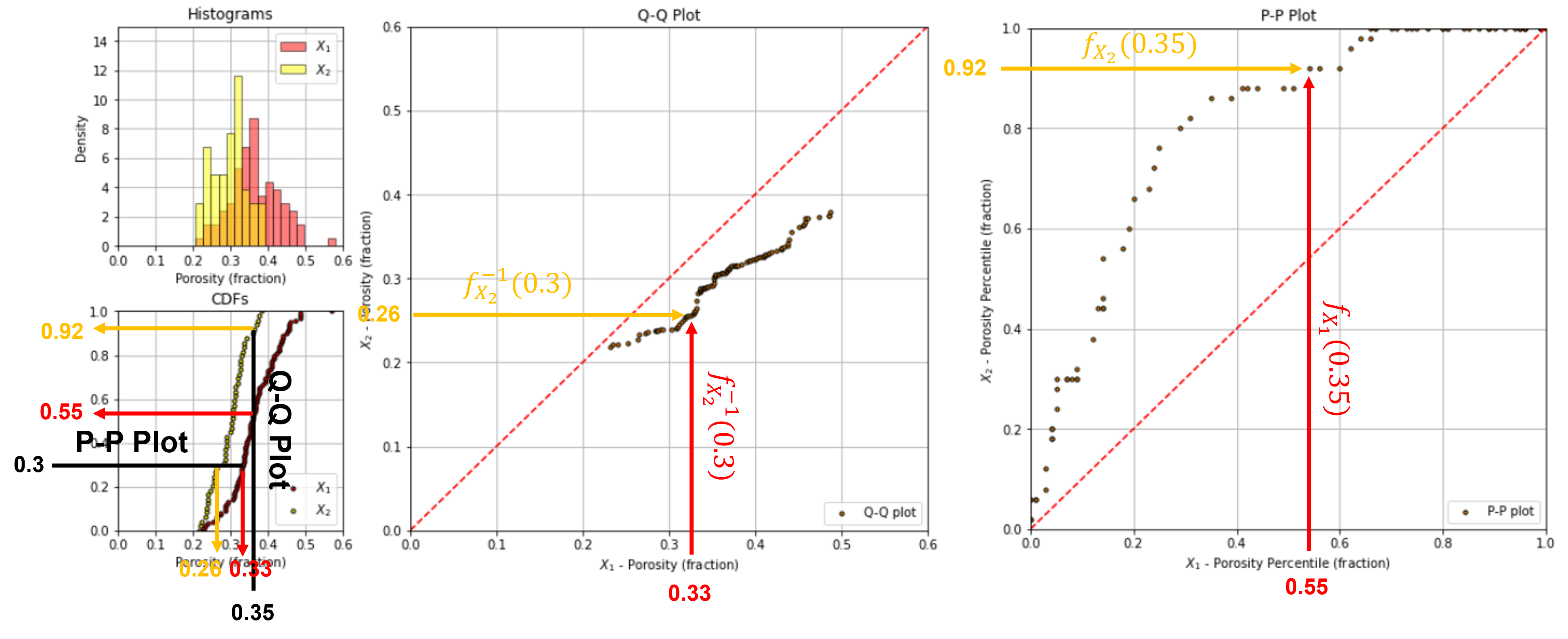
To visualize the calculation of a QQ-plot see this illustration of the calculation of a single point for the 80th percentile.
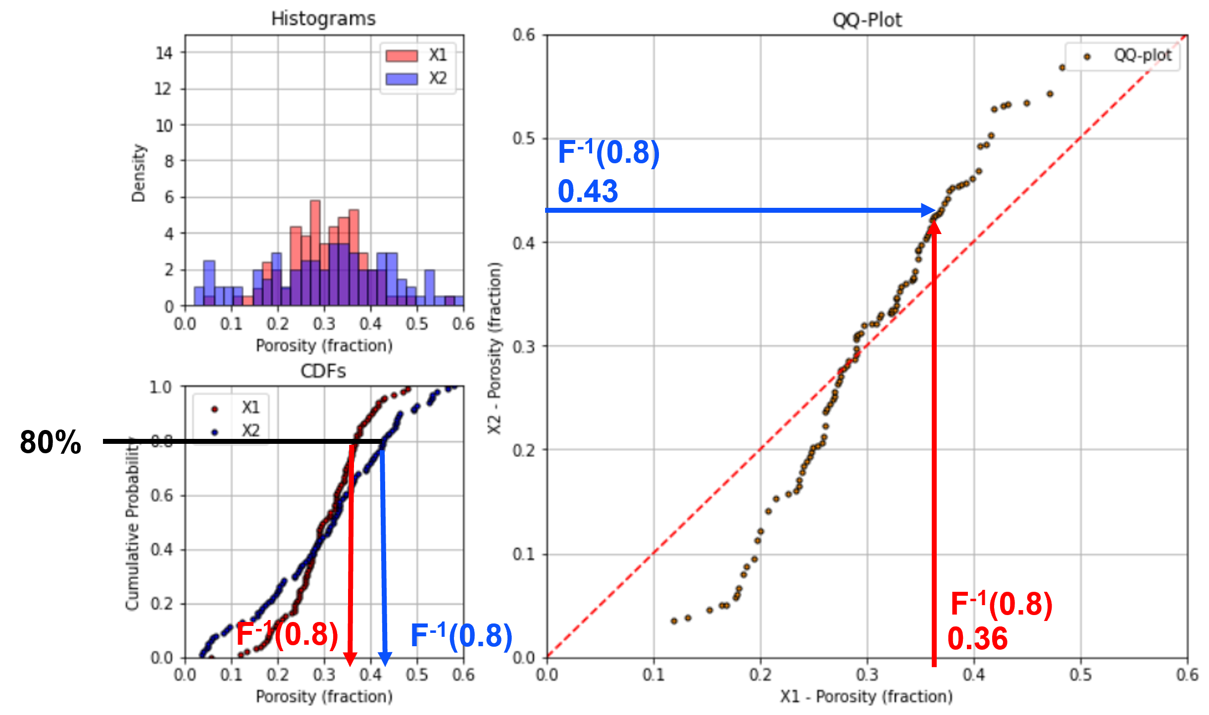
QQ-Plot Interpretation#
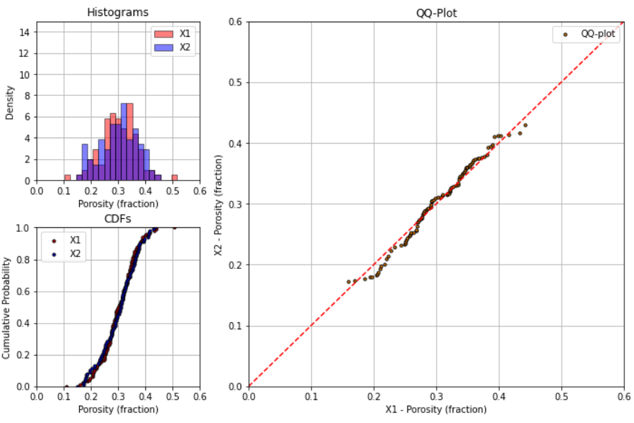
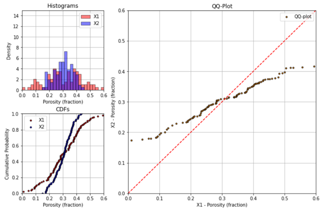
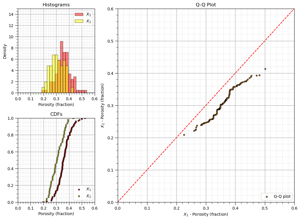
If the two distributions are the same, then all the percentiles will be equal and the points will all fall on the 45 degree line. Here’s an example with very similar distributions.
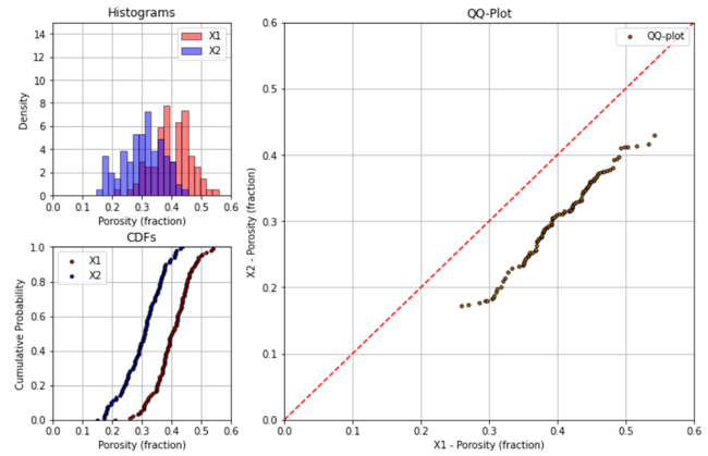
If the means of the two distributions are different, then the points will be shifted from the 45 degree line.
down and right from the 45 degree line if distribution on x-axis is has a larger mean than the distribution on the y-axis
up and left from the 45 degree line if distribution on x-axis is has a smaller mean than the distribution on the y-axis
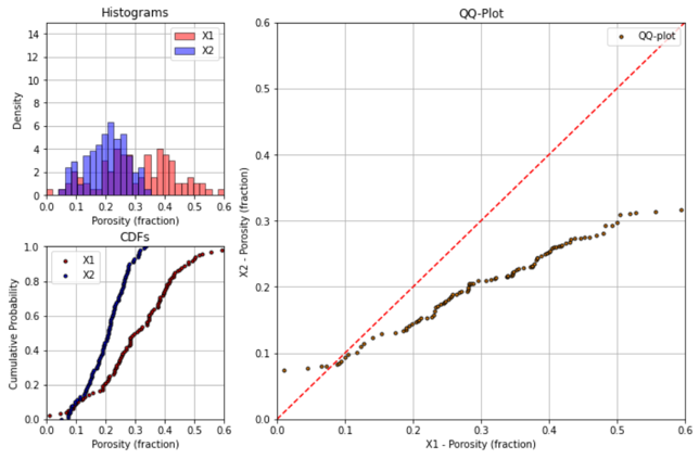
If the variances (or standard deviations) of the two distributions are different, then the points will appear to be stretched out along the axis for the distribution with greater variance.
difference in variance will appear like a “rotation” from the 45 degree line
Of course, both the mean and variance can be different.
Finally, it is possible for distributions to be similar and then to diverge only for part of the distribution. This will be quite clear on a QQ-plot.
PP-plot#
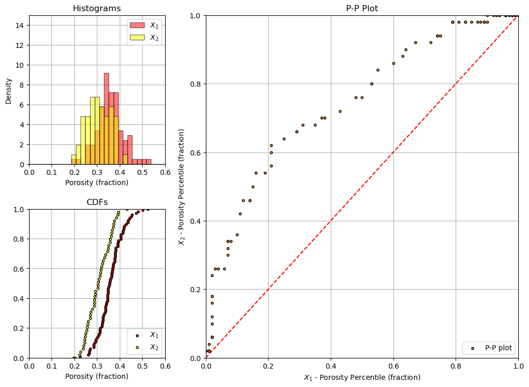
There is an alternative to the QQ-plot, the PP-plot. Instead of matching by percentiles like a QQ-plot, a PP-plot matches by values and plots the cumulative probabilities.
tails better expressed (difference magnified) on QQ-plot
mode better expressed (difference magnified) with PP-plot
QQ-plot is a distribution transform function
PP-plot low and upper tails are forced to be 0.0, 0.0 and 1.0, 1.0 respectively, forcing the plots to be more similar than QQ-plots
To visualize the calculation of a PP-plot see this illustration of the calculation of a single point for the 0.35 porosity.
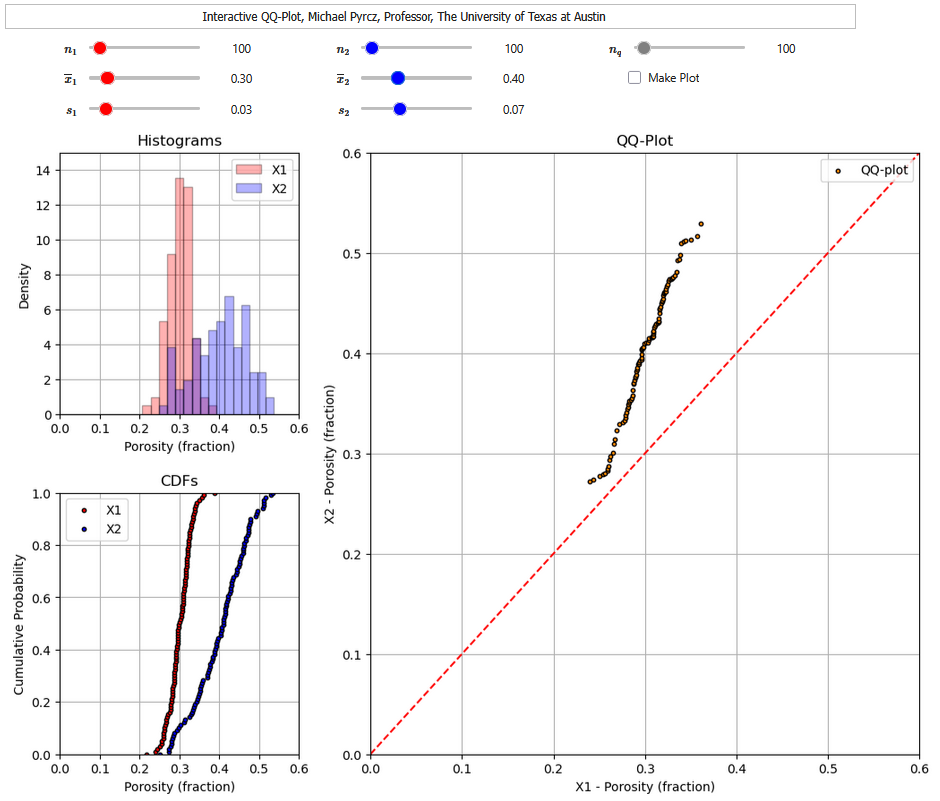
Interactive Dashboards#
To help you learn this concept by interacting with the method, I have built out an interactive Python dashboard QQ-plots,
and another interactive Python dashboard PP-plots.
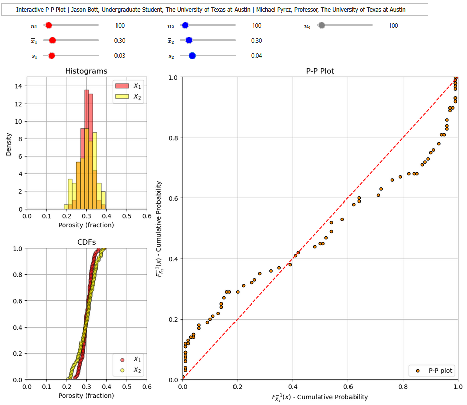
For each of the interactive Python dashboard you can vary the mean, variance and number of samples for the distributions and observe the changes in the QQ-plot or PP-plot.
Getting Started#
Here’s the steps to get setup in Python with the GeostatsPy package:
Install Anaconda 3 on your machine (https://www.anaconda.com/download/).
From Anaconda Navigator (within Anaconda3 group), go to the environment tab, click on base (root) green arrow and open a terminal.
In the terminal type: pip install geostatspy.
Open Jupyter and in the top block get started by copy and pasting the code block below from this Jupyter Notebook to start using the geostatspy functionality.
You will need to copy the data file to your working directory. The dataset is available on my GitHub account in my GeoDataSets repository at:
Tabular data - 2D_MV_200wells.csv
Load the Required Libraries#
The following code loads the required libraries.
import geostatspy.GSLIB as GSLIB                              # GSLIB utilities, visualization and wrapper
import geostatspy.geostats as geostats                        # GSLIB methods convert to Python
import geostatspy
print('GeostatsPy version: ' + str(geostatspy.__version__))
GeostatsPy version: 0.0.71
We will also need some standard packages. These should have been installed with Anaconda 3.
ignore_warnings = True                                        # ignore warnings?
import numpy as np                                            # ndarrays for gridded data
import pandas as pd                                           # DataFrames for tabular data
from scipy import stats                                       # inverse percentiles, percentileofscore function for P-P plots
import os                                                     # set working directory, run executables
import matplotlib.pyplot as plt                               # plotting
from matplotlib.ticker import (MultipleLocator, AutoMinorLocator) # control of axes ticks
import matplotlib.gridspec as gridspec
plt.rc('axes', axisbelow=True)
if ignore_warnings == True:
    import warnings
    warnings.filterwarnings('ignore')
cmap = plt.cm.inferno                                         # color map
seed = 42                                                     # random number seed
If you get a package import error, you may have to first install some of these packages. This can usually be accomplished by opening up a command window on Windows and then typing ‘python -m pip install [package-name]’. More assistance is available with the respective package docs.
Declare Functions#
Let’s define a single function to streamline plotting correlation matrices. I also added a convenience function to add major and minor gridlines to improve plot interpretability.
def add_grid():
    plt.gca().grid(True, which='major',linewidth = 1.0); plt.gca().grid(True, which='minor',linewidth = 0.2) # add y grids
    plt.gca().tick_params(which='major',length=7); plt.gca().tick_params(which='minor', length=4)
    plt.gca().xaxis.set_minor_locator(AutoMinorLocator()); plt.gca().yaxis.set_minor_locator(AutoMinorLocator()) # turn on minor ticks

def add_grid2(sub_plot):
    sub_plot.grid(True, which='major',linewidth = 1.0); sub_plot.grid(True, which='minor',linewidth = 0.2) # add y grids
    sub_plot.tick_params(which='major',length=7); sub_plot.tick_params(which='minor', length=4)
    sub_plot.xaxis.set_minor_locator(AutoMinorLocator()); sub_plot.yaxis.set_minor_locator(AutoMinorLocator()) # turn on minor ticks
Set the Working Directory#
I always like to do this so I don’t lose files and to simplify subsequent read and writes (avoid including the full address each time). Set this to your working directory, with the above mentioned data file.
#os.chdir("d:/PGE383") # set the working directory
Make Data#
Let’s specify two univariate Gaussian distribution and then sample from this distribution.
This allows us to vary the distributions and number of data and visualize the impact on the QQ-plot.
n1 = 100; mean1 = 0.35; stdev1 = 0.06                         # specify the two distribution (assume Gaussian)
n2 = 50; mean2 = 0.3; stdev2 = 0.05

X1 = np.random.normal(loc=mean1,scale=stdev1,size=n1)
X2 = np.random.normal(loc=mean2,scale=stdev2,size=n2)
Calculate the QQ-plot#
Calculate and match percentiles from both data distributions.
nq = 100                                                      # the number of points (equal cumulative probability) sampled for the QQ-plot
xmin=0.0; xmax=0.6                                            # the range values for the plot axes

cumul_prob = np.linspace(1,99,nq)                             # cumulative probability array
X1_percentiles = np.percentile(X1,cumul_prob)                 # calculate all percentiles for plotting
X2_percentiles = np.percentile(X2,cumul_prob)
Make the Q-Q Plot Visualization#
Let’s look at the data histograms, cumulative distribution functions and QQ-plot.
fig = plt.figure()
spec = fig.add_gridspec(2, 3)

ax0 = fig.add_subplot(spec[:, 1:])
plt.scatter(X1_percentiles,X2_percentiles,color='darkorange',edgecolor='black',s=10,label='Q-Q plot')
plt.plot([0,1],[0,1],ls='--',color='red')
plt.grid(); plt.xlim([xmin,xmax]); plt.ylim([xmin,xmax]); plt.xlabel(r'$X_1$ - Porosity (fraction)'); plt.ylabel(r'$X_2$ - Porosity (fraction)');
plt.title('Q-Q Plot'); plt.legend(loc='lower right')
add_grid2(ax0)

ax10 = fig.add_subplot(spec[0, 0])
plt.hist(X1,bins=np.linspace(xmin,xmax,30),color='red',alpha=0.5,edgecolor='black',label=r'$X_1$',density=True)
plt.hist(X2,bins=np.linspace(xmin,xmax,30),color='yellow',alpha=0.5,edgecolor='black',label=r'$X_2$',density=True)
plt.grid(); plt.xlim([xmin,xmax]); plt.ylim([0,15]); plt.xlabel('Porosity (fraction)'); plt.ylabel('Density')
plt.title('Histograms'); plt.legend(loc='upper right')
add_grid2(ax10)

ax11 = fig.add_subplot(spec[1, 0])
plt.scatter(np.sort(X1),np.linspace(0,1,len(X1)),color='red',edgecolor='black',s=10,label=r'$X_1$')
plt.scatter(np.sort(X2),np.linspace(0,1,len(X2)),color='yellow',edgecolor='black',s=10,label=r'$X_2$')
plt.grid(); plt.xlim([xmin,xmax]); plt.ylim([0,1]); plt.xlabel('Porosity (fraction)'); plt.title('CDFs'); plt.legend(loc='lower right')
add_grid2(ax11)

plt.subplots_adjust(left=0.0, bottom=0.0, right=1.5, top=1.4, wspace=0.3, hspace=0.3); plt.show()
Calculate the P-P plot#
Calculate and match the values from both data distributions and plot the cumulative probabilities.
min_X = min(X1.min(),X2.min())                                # find the min and max feature values for interval to sample
max_X = max(X1.max(),X2.max())

X_values = np.linspace(min_X,max_X,nq)                        # values to sample

X1_cumul_probs = []; X2_cumul_probs = []

for X in X_values:                                            # final percentiles to plot
    X1_cumul_probs.append(stats.percentileofscore(X1,X)/100)
    X2_cumul_probs.append(stats.percentileofscore(X2,X)/100)

X1_cumul_probs = np.asarray(X1_cumul_probs); X2_cumul_probs = np.asarray(X2_cumul_probs)
Make the P-P Plot Visualization#
Let’s look at the data histograms, cumulative distribution functions and QQ-plot.
fig = plt.figure()
spec = fig.add_gridspec(2, 3)

ax0 = fig.add_subplot(spec[:, 1:])
plt.scatter(X1_cumul_probs,X2_cumul_probs,color='darkorange',edgecolor='black',s=10,label='P-P plot')
plt.plot([0,1.0],[0,1.0],ls='--',color='red')
plt.grid(); plt.xlim([0.0,1.0]); plt.ylim([0.0,1.0]); plt.xlabel(r'$X_1$ - Porosity Percentile (fraction)'); plt.ylabel(r'$X_2$ - Porosity Percentile (fraction)');
plt.title('P-P Plot'); plt.legend(loc='lower right')

ax10 = fig.add_subplot(spec[0, 0])
plt.hist(X1,bins=np.linspace(xmin,xmax,30),color='red',alpha=0.5,edgecolor='black',label=r'$X_1$',density=True)
plt.hist(X2,bins=np.linspace(xmin,xmax,30),color='yellow',alpha=0.5,edgecolor='black',label=r'$X_2$',density=True)
plt.grid(); plt.xlim([xmin,xmax]); plt.ylim([0,15]); plt.xlabel('Porosity (fraction)'); plt.ylabel('Density')
plt.title('Histograms'); plt.legend(loc='upper right')

ax11 = fig.add_subplot(spec[1, 0])
plt.scatter(np.sort(X1),np.linspace(0,1,len(X1)),color='red',edgecolor='black',s=10,label=r'$X_1$')
plt.scatter(np.sort(X2),np.linspace(0,1,len(X2)),color='yellow',edgecolor='black',s=10,label=r'$X_2$')
plt.grid(); plt.xlim([xmin,xmax]); plt.ylim([0,1]); plt.xlabel('Porosity (fraction)'); plt.title('CDFs'); plt.legend(loc='lower right')

plt.subplots_adjust(left=0.0, bottom=0.0, right=1.5, top=1.4, wspace=0.3, hspace=0.3); plt.show()
About the Author#

Michael Pyrcz is a professor in the Cockrell School of Engineering, and the Jackson School of Geosciences, at The University of Texas at Austin, where he researches and teaches subsurface, spatial data analytics, geostatistics, and machine learning. Michael is also,
the principal investigator of the Energy Analytics freshmen research initiative and a core faculty in the Machine Learn Laboratory in the College of Natural Sciences, The University of Texas at Austin
an associate editor for Computers and Geosciences, and a board member for Mathematical Geosciences, the International Association for Mathematical Geosciences.
Michael has written over 70 peer-reviewed publications, a Python package for spatial data analytics, co-authored a textbook on spatial data analytics, Geostatistical Reservoir Modeling and author of two recently released e-books, Applied Geostatistics in Python: a Hands-on Guide with GeostatsPy and Applied Machine Learning in Python: a Hands-on Guide with Code.
All of Michael’s university lectures are available on his YouTube Channel with links to 100s of Python interactive dashboards and well-documented workflows in over 40 repositories on his GitHub account, to support any interested students and working professionals with evergreen content. To find out more about Michael’s work and shared educational resources visit his Website.
Want to Work Together?#
I hope this content is helpful to those that want to learn more about subsurface modeling, data analytics and machine learning. Students and working professionals are welcome to participate.
Want to invite me to visit your company for training, mentoring, project review, workflow design and / or consulting? I’d be happy to drop by and work with you!
Interested in partnering, supporting my graduate student research or my Subsurface Data Analytics and Machine Learning consortium (co-PI is Professor John Foster)? My research combines data analytics, stochastic modeling and machine learning theory with practice to develop novel methods and workflows to add value. We are solving challenging subsurface problems!
I can be reached at mpyrcz@austin.utexas.edu.
I’m always happy to discuss,
Michael
Michael Pyrcz, Ph.D., P.Eng. Professor, Cockrell School of Engineering and The Jackson School of Geosciences, The University of Texas at Austin
More Resources Available at: Twitter | GitHub | Website | GoogleScholar | Geostatistics Book | YouTube | Applied Geostats in Python e-book | Applied Machine Learning in Python e-book | LinkedIn
Comments#
I hope you found this chapter helpful. Much more could be done and discussed, I have many more resources. Check out my shared resource inventory,
Michael