
Multidimensional Scaling#
Michael J. Pyrcz, Professor, The University of Texas at Austin
Twitter | GitHub | Website | GoogleScholar | Geostatistics Book | YouTube | Applied Geostats in Python e-book | Applied Machine Learning in Python e-book | LinkedIn
Chapter of e-book “Applied Machine Learning in Python: a Hands-on Guide with Code”.
Cite this e-Book as:
Pyrcz, M.J., 2024, Applied Machine Learning in Python: A Hands-on Guide with Code [e-book]. Zenodo. doi:10.5281/zenodo.15169138
The workflows in this book and more are available here:
Cite the MachineLearningDemos GitHub Repository as:
Pyrcz, M.J., 2024, MachineLearningDemos: Python Machine Learning Demonstration Workflows Repository (0.0.3) [Software]. Zenodo. DOI: 10.5281/zenodo.13835312. GitHub repository: GeostatsGuy/MachineLearningDemos
By Michael J. Pyrcz
© Copyright 2024.
This chapter is a tutorial for / demonstration of Multidimensional Scaling.
YouTube Lecture: check out my lectures on:
These lectures are all part of my Machine Learning Course on YouTube with linked well-documented Python workflows and interactive dashboards. My goal is to share accessible, actionable, and repeatable educational content. If you want to know about my motivation, check out Michael’s Story.
Motivation for Multidimensional Scaling#
Working with more features / variables is harder!
More difficult to visualize data and model
More data are required to infer the joint probabilities
Less data coverage of feature space
More difficult to interrogate / check the model
More likely redundant features, e.g., multicollinearity, resulting in model instability
More computational effort, more computational resources and longer run times
More complicated model is more likely overfit
More professional time for model construction
We get a better model with fewer, informative features than throwing all our features into the model!
Inferential Machine Learning#
There are no response features, \(y\), just predictor features,
Machine learns by mimicry a compact representation of the data
Captures patterns as feature projections, group assignments, neural network latent features, etc.
We focus on inference of the population, the natural system, instead of prediction of response features.
Multidimensional Scaling#
A powerful ordination method in inferential statistics / information visualization for exploring / visualizing the similarity (conversely the difference) between individual samples from a high dimensional dataset.
beyond 2 or 3 features it is difficult to visualize the relationships within our datasets
for 2 features we can easily visualize the relationships between data samples with a regular scatter plot
for 3 features we can either visualize our scatter plot in 3D (e.g., with interactive rotation) or by including color or through marginalization with matrix scatter plots
Multidimensional scaling projects the \(m\) dimensional data to \(p\) dimensions such that \(p << m\).
ideally we are able to project to \(p=2\) to easily explore the relationships between the samples
While principal component analysis (PCA) operates with the covariance matrix, multidimensional scaling operates with the distance / dissimilarity matrix. For multidimensional scaling:
you don’t need to know the actual feature values, just the distance or dissimilarity between the samples
as with any distance in feature space, we consider feature standardization to ensure that features with larger variance do not dominate the calculation
we may work with a variety of dissimilarity measures
Simple Demonstrations of Multidimensional Scaling#
Let’s say that we have,
a list of cities, Boston, Chicago, DC, Denver, etc.
along with their X and Y locations (ignore geodesic considerations)
We have the locations, and we calculate the distance between each of the cities, a measure of pairwise sample dissimilarity by Euclidean distance, the distance matrix,
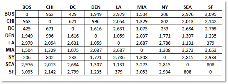
It is logical that from these pairwise distances between each city, we project the cities into a 2D space such that we preserve the distances between the cities.
this is the result if we do this.
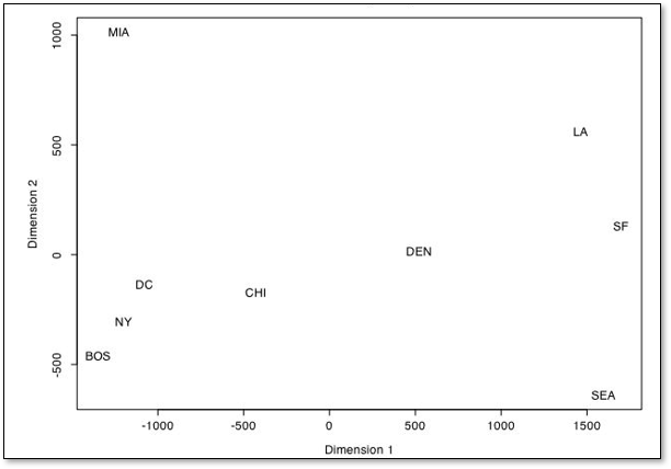
Unsurprisingly the matrix of distances between cities is perfectly reproduced, since the original data is in 2D, \(X\) and \(Y\) coordinates, ignoring geodesic context
the distance matrix did not include any information about orientation or origin
This method is invariant and insensitive to,
translation - often the results are centered on 0, 0
rotation - the orientation is arbitrary
reflection - as we see with the example above, the \(Y\) coordinate is flipped, but the pairwise distances are correct
of course we could correct the resulting projection.
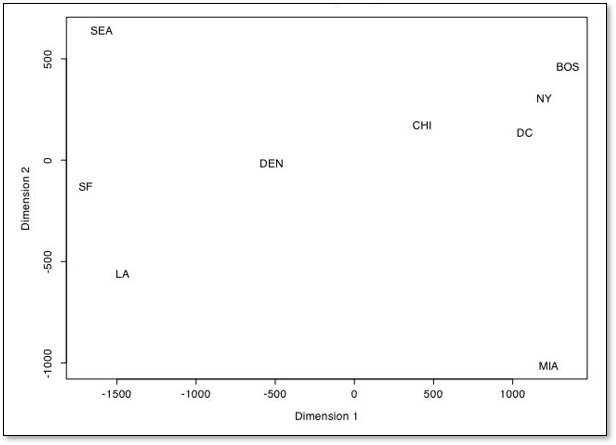
Of course, this example is trivial. Let’s demonstrate dimensionality reduction with a MDS workflow developed by Alan Scherman while working with me on a summer undergraduate research project during an undergraduate Engineering B.Sc. at Rice University.
Alan took 20 cities, 10 from Texas and 10 from California and tabulated the distance from the centroid of the state, population, median income and average commute time and calculate the dissimilarity as the Euclidian norm.
where \(d^{\Delta}\) is distance from state centroid, \(N\) is population, \(I^{P50}\) is median income and \(\overline{t}\) is average commute time. This Euclidian city dissimilarity is applied to calculate this dissimilarity matrix.
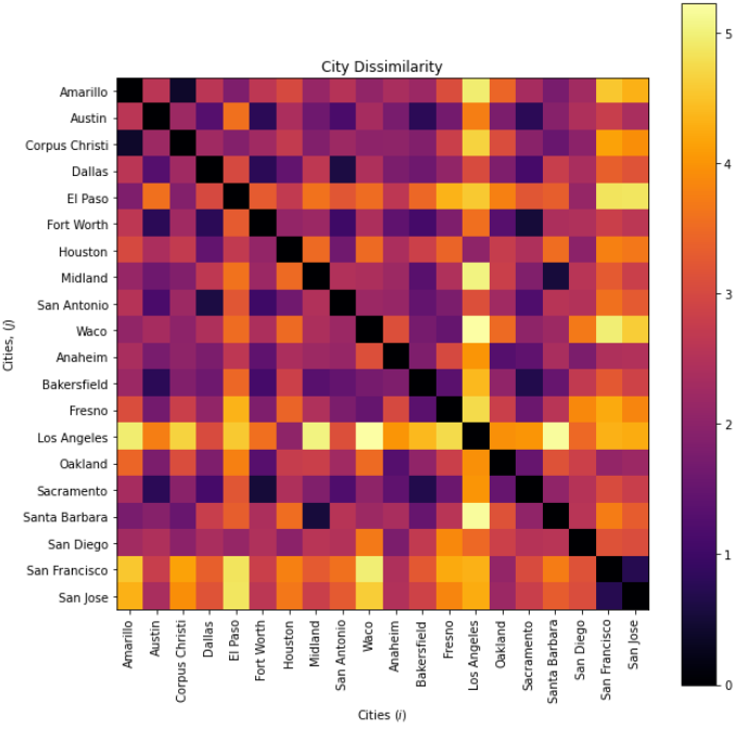
then with multidimensional scaling the cities are projected into a 2D space,
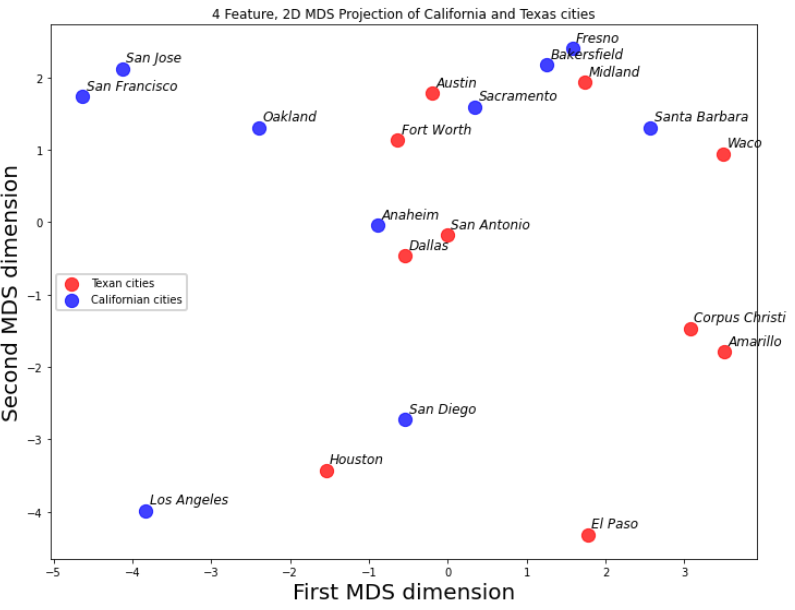
The groupings and spacing are informative.
San Jose, San Francisco and Oakland for a group and Fresno, Bakersfield and Midland form another group
Corpus Christi and Amarillo are unlike Texas and all California cities
Given these simple demonstrations, let’s now get into the multidimensional scaling methods for projecting to 2D from a dissimilarity matrix,
Classical Multidimensional Scaling#
Based on Euclidian distance between samples.
The Steps:
calculate the square, symmetric distance matrix:
where \(\delta_{i,j}^2\) is Euclidean distance between data samples at data indices \(i\) and \(j\).
apply double centering \(B = - \frac{1}{2} J D^{(2)} J\)
solve for the eigenvalues, \(\lambda_1,\ldots,\lambda_p\)
solve for the projected coordinates, \(x^{'}_1, \dots ,x^{'}_p\)
where \(E_m\) is the matrix of eigenvectors and \(\land_m\) is the diagonal matrix of eigenvalues.
General comments about classical multidimensional scaling:
nonlinear dimensionality reduction
no distribution assumption
the transform may not be unique, and may be arbitrarily be translated, rotated and transformed (note, these do not change the pairwise distances \(\delta_{i,j}^2\)).
Metric Multidimensional Scaling#
A generalization of classical multidimensional scaling with a variety of metrics and a loss function optimization.
formulated as an optimization problem to minimize the square difference between the original and projected pairwise distances
where \(||x_i - x_j||\) are the pairwise distances in the projected space (\(p\) dimensional) and \(\delta_{i,j}\) are the pairwise distances in the original feature space.
General comments about metric multidimensional scaling:
dissimilarity measure must be meaningful
dimensionality reduction is performed such that the error in the sample pairwise distance is minimized
there is a variant known as non-metric multidimensional scaling for ordinal features (categorical with ordering).
Checking Multidimensional Scaling Results#
The multidimensional scaling approach minimizes the square difference of the pairwise distances between all of the data samples and each other between the projected, lower dimensional, and original feature space.
stress is defined as:
it is also useful to visualize the scatterplot of projected vs. original pairwise distances
Comparison with Principal Component Analysis#
MDS and PCA are quite different, here’s a short summary of each to help elucidate the difference:
Principal component analysis takes the covariance matrix (\(m \times m\)) between all the features and finds the orthogonal rotation such that the variance is maximized over the ordered principle components.
Multidimensional scaling takes the matrix of the pairwise distances (\(n \times n\)) between all the samples in feature space and finds the nonlinear projection such that the error in the pairwise distances is minimized.
Load the Required Libraries#
The following code loads the required libraries. These should have been installed with Anaconda 3.
ignore_warnings = True                                        # ignore warnings?
import numpy as np                                            # ndarrays for gridded data
import pandas as pd                                           # DataFrames for tabular data
import copy                                                   # for deep copies
import os                                                     # set working directory, run executables
import matplotlib.pyplot as plt                               # for plotting
from matplotlib.colors import ListedColormap                  # custom color maps
from matplotlib.ticker import (MultipleLocator,AutoMinorLocator,NullLocator,FuncFormatter) # control of axes ticks
from scipy import stats                                       # summary statistics
import math                                                   # trigonometry etc.
import scipy.signal as signal                                 # kernel for moving window calculation
import random                                                 # for random numbers
import seaborn as sns                                         # for matrix scatter plots
from scipy import linalg                                      # for linear regression
from sklearn.preprocessing import StandardScaler # feature standardization
from sklearn.manifold import MDS                              # multidimensional scaling
from sklearn.metrics.pairwise import euclidean_distances
plt.rc('axes', axisbelow=True)                                # plot all grids below the plot elements
if ignore_warnings == True:
    import warnings
    warnings.filterwarnings('ignore')
cmap = plt.cm.inferno                                         # color map
seed = 42                                                     # random number seed
If you get a package import error, you may have to first install some of these packages. This can usually be accomplished by opening up a command window on Windows and then typing ‘python -m pip install [package-name]’. More assistance is available with the respective package docs.
Declare Functions#
Convenience functions to add commas to numbers and major and minor gridlines to plots.
def comma_format(x, pos):
    return f'{int(x):,}'

def add_grid():
    plt.gca().grid(True, which='major',linewidth = 1.0); plt.gca().grid(True, which='minor',linewidth = 0.2) # add y grids
    plt.gca().tick_params(which='major',length=7); plt.gca().tick_params(which='minor', length=4)
    plt.gca().xaxis.set_minor_locator(AutoMinorLocator()); plt.gca().yaxis.set_minor_locator(AutoMinorLocator()) # turn on minor ticks
Set the Working Directory#
I always like to do this so I don’t lose files and to simplify subsequent read and writes (avoid including the full address each time).
#os.chdir("c:/PGE383") # set the working directory
You will have to update the part in quotes with your own working directory and the format is different on a Mac (e.g. “~/PGE”).
Loading Data#
Let’s load the provided multivariate, spatial dataset unconv_MV.csv available in my GeoDataSet repo. It is a comma delimited file with:
well index (integer)
porosity (%)
permeability (\(mD\))
acoustic impedance (\(\frac{kg}{m^3} \cdot \frac{m}{s} \cdot 10^6\)).
brittleness (%)
total organic carbon (%)
vitrinite reflectance (%)
initial gas production (90 day average) (MCFPD)
We load it with the pandas ‘read_csv’ function into a data frame we called ‘df’ and then preview it to make sure it loaded correctly.
Python Tip: using functions from a package just type the label for the package that we declared at the beginning:
import pandas as pd
so we can access the pandas function ‘read_csv’ with the command:
pd.read_csv()
but read csv has required input parameters. The essential one is the name of the file. For our circumstance all the other default parameters are fine. If you want to see all the possible parameters for this function, just go to the docs here.
The docs are always helpful
There is often a lot of flexibility for Python functions, possible through using various inputs parameters
also, the program has an output, a pandas DataFrame loaded from the data. So we have to specficy the name / variable representing that new object.
df = pd.read_csv("unconv_MV.csv")
Let’s run this command to load the data and then this command to extract a random subset of the data.
df = df.sample(frac=.30, random_state = 73073);
df = df.reset_index()
df = pd.read_csv(r'https://raw.githubusercontent.com/GeostatsGuy/GeoDataSets/master/unconv_MV_v4.csv')

index = ['Well']
Xname = ['Por','AI','TOC']                                    # specify features of interest

yname = ['Prod']
df =  df[index + Xname + yname]

Xunit = ['%',r'$kg/m2 \times 10^6$','%']; Xlabel = ['Porosity','Acoustic Impedance','Total Organic Carbon'] # specify features' metadata
Xlabelunit = [f"{s1} ({s2})" for s1, s2 in zip(Xlabel, Xunit)]
Xmin = [0.0,0.0,0.0]; Xmax = [30.0,5.0,100.0]                 # set minimums and maximums for visualization
nXname = ['n' + feature for feature in Xname]                 # labels, units and ranges for normalized features

normalized = StandardScaler().fit_transform(df[Xname])        # standardize the features

for col_name, new_col in zip(nXname, normalized.T):           # add standardized features to the DataFrame
    df[col_name] = new_col

nXunit = ['norm[' + unit + ']' for unit in Xunit]             # specify the standardized features' metadata
nXlabel = ['Normalized ' + feature for feature in Xlabel]
nXlabelunit = [f"{s1} ({s2})" for s1, s2 in zip(nXlabel, nXunit)]
nXmin = [-3.0,-3.0,-3.0]; nXmax = [3.0,3.0,3.0]
Visualize the Loaded DataFrame#
df.head(n=4) # we could also use this command for a table preview
| Well | Por | AI | TOC | Prod | nPor | nAI | nTOC | |
|---|---|---|---|---|---|---|---|---|
| 0 | 1 | 12.08 | 2.80 | 1.16 | 1695.360819 | -0.982256 | -0.298603 | 0.352948 |
| 1 | 2 | 12.38 | 3.22 | 0.89 | 3007.096063 | -0.881032 | 0.444147 | -0.209104 |
| 2 | 3 | 14.02 | 4.01 | 0.89 | 2531.938259 | -0.327677 | 1.841224 | -0.209104 |
| 3 | 4 | 17.67 | 2.63 | 1.08 | 5288.514854 | 0.903875 | -0.599240 | 0.186414 |
Summary Statistics#
Let’s check the summary statistics of our data.
df.describe()
| Well | Por | AI | TOC | Prod | nPor | nAI | nTOC | |
|---|---|---|---|---|---|---|---|---|
| count | 200.000000 | 200.000000 | 200.000000 | 200.000000 | 200.000000 | 2.000000e+02 | 2.000000e+02 | 2.000000e+02 |
| mean | 100.500000 | 14.991150 | 2.968850 | 0.990450 | 3864.407081 | 2.486900e-16 | 4.130030e-16 | 3.375078e-16 |
| std | 57.879185 | 2.971176 | 0.566885 | 0.481588 | 1553.277558 | 1.002509e+00 | 1.002509e+00 | 1.002509e+00 |
| min | 1.000000 | 6.550000 | 1.280000 | -0.190000 | 839.822063 | -2.848142e+00 | -2.986650e+00 | -2.457313e+00 |
| 25% | 50.750000 | 12.912500 | 2.547500 | 0.617500 | 2686.227611 | -7.013606e-01 | -7.451372e-01 | -7.763606e-01 |
| 50% | 100.500000 | 15.070000 | 2.955000 | 1.030000 | 3604.303506 | 2.660490e-02 | -2.449306e-02 | 8.233024e-02 |
| 75% | 150.250000 | 17.402500 | 3.345000 | 1.350000 | 4752.637555 | 8.136175e-01 | 6.652032e-01 | 7.484661e-01 |
| max | 200.000000 | 23.550000 | 4.630000 | 2.180000 | 8590.384044 | 2.887855e+00 | 2.937664e+00 | 2.476256e+00 |
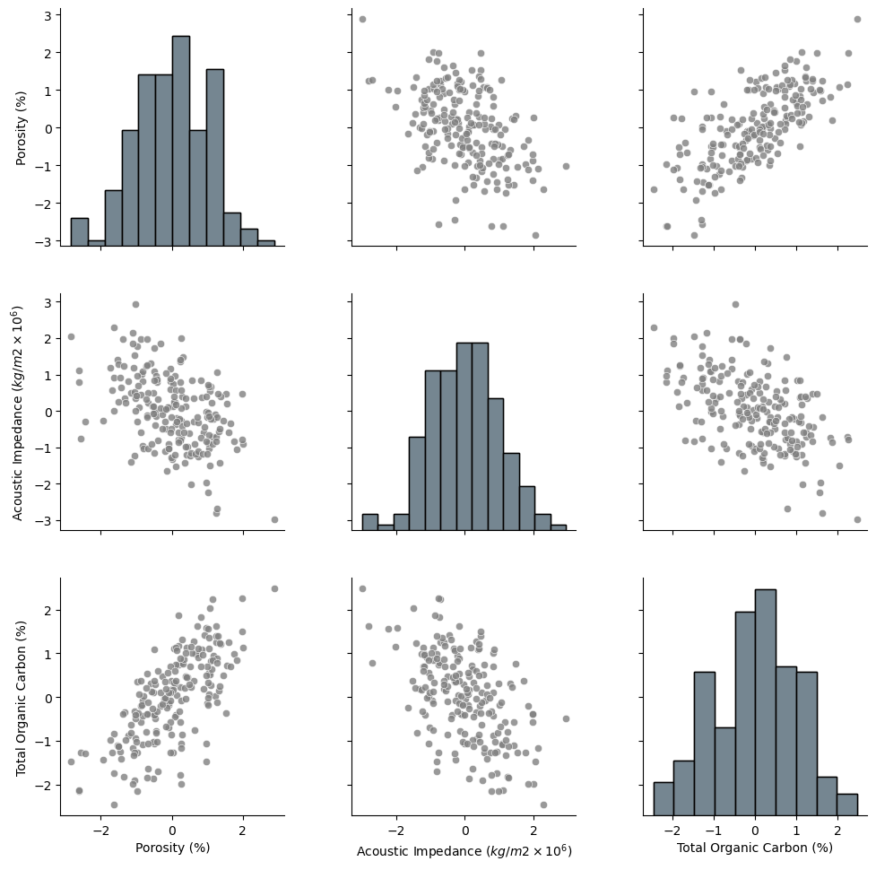
The data looks to be in pretty good shape and for brevity we skip outlier detection. Let’s look at the distributions with a matrix scatter plot from the Seaborn package.
pairplot = sns.pairplot(df,vars=nXname,markers='o',plot_kws={'color':'grey','alpha': 0.8},)
pairplot.map_diag(sns.histplot, color='grey', kde=False)
pairplot.x_vars = Xlabelunit; pairplot.y_vars = Xlabelunit; pairplot._add_axis_labels()
plt.subplots_adjust(left=0.0, bottom=0.0, right=1.2, top=1.2, wspace=0.3, hspace=0.2); plt.show()
Data Preparation#
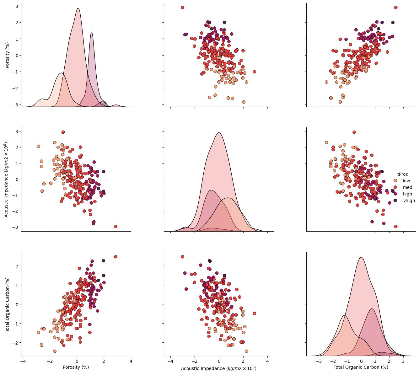
Let’s make an ordinal feature from the continuous production:
low
medium
high
very high
production rates. This will help us visualize the results as we proceed, we can look at wells with different levels of production projected into a variety of lower dimensional spaces with multidimensional scaling.
bins = [0,2500,5000,7500,10000]                               # assign the production bins (these are the fence posts)

labels = ['low', 'med', 'high', 'vhigh']                      # assign the labels
category = pd.cut(df[yname].values.reshape(-1),bins,labels=labels) # make the 1D array with the labels for our data
df['tProd'] = category                                        # add the new ordinal production feature to our DataFrames
df.head()
dpalette = sns.color_palette("rocket_r",n_colors = 4)
palette = sns.color_palette("rocket")
Let’s take a look at the matrix scatter plot of our 3 features and the production levels.
pairplot2 = sns.pairplot(df[nXname + ['tProd']],markers='o',hue = 'tProd', palette = dpalette,diag_kws={'edgecolor':'black'},
                    plot_kws=dict(s=50, edgecolor="black", linewidth=0.5))
pairplot2.x_vars = Xlabelunit; pairplot2.y_vars = Xlabelunit; pairplot2._add_axis_labels()
plt.subplots_adjust(left=0.0, bottom=0.0, right=1.5, top=1.5, wspace=0.3, hspace=0.2); plt.show()
Multidimensional Scaling#
The multidimensional scaling method follows the sample pattern as other scikit-learn methods, we:
instantiate
fit
apply, transform or predict
Let’s run multidimensional scaling on our subset of features (\(m = 3\)) and project to only 2 features (\(p = 2\)).
we set the random_state for repeatability, everyone gets the same result from the iterative solution
we use 20 random initializations, the best solution is selected to improve likelihood of selection of (or search resulting in) the global optimum and not a local optimum
we use an increased number of max_iter to improve the convergence
np.random.seed(seed)                                          # set the random number seed, so we all get the same answer
n_components = 2                                              # p, reduced dimensionality space
embedding = MDS(n_components=2,n_init = 20,max_iter = 1000,random_state = 73073) # instantiate and set the hyperparameter
MDS_transformed = embedding.fit_transform(df[nXname])
MDS_transformed.shape
(200, 2)
The output is 2 multidimensional scaling components. We have projected our 3 features to 2 features to minimize the error in pairwise distance between the samples. Let’s add the 2 components to our DataFrame.
df['MDS1'] = MDS_transformed[:,0]                             # add MDS projections to DataFrame
df['MDS2'] = MDS_transformed[:,1]
df.head()
| Well | Por | AI | TOC | Prod | nPor | nAI | nTOC | tProd | MDS1 | MDS2 | |
|---|---|---|---|---|---|---|---|---|---|---|---|
| 0 | 1 | 12.08 | 2.80 | 1.16 | 1695.360819 | -0.982256 | -0.298603 | 0.352948 | low | 0.619075 | -0.641325 |
| 1 | 2 | 12.38 | 3.22 | 0.89 | 3007.096063 | -0.881032 | 0.444147 | -0.209104 | med | 0.872691 | 0.306021 |
| 2 | 3 | 14.02 | 4.01 | 0.89 | 2531.938259 | -0.327677 | 1.841224 | -0.209104 | med | 0.458548 | 1.846056 |
| 3 | 4 | 17.67 | 2.63 | 1.08 | 5288.514854 | 0.903875 | -0.599240 | 0.186414 | high | -0.885125 | -0.484969 |
| 4 | 5 | 17.52 | 3.18 | 1.51 | 2859.469624 | 0.853263 | 0.373409 | 1.081534 | med | -1.382408 | 0.413270 |
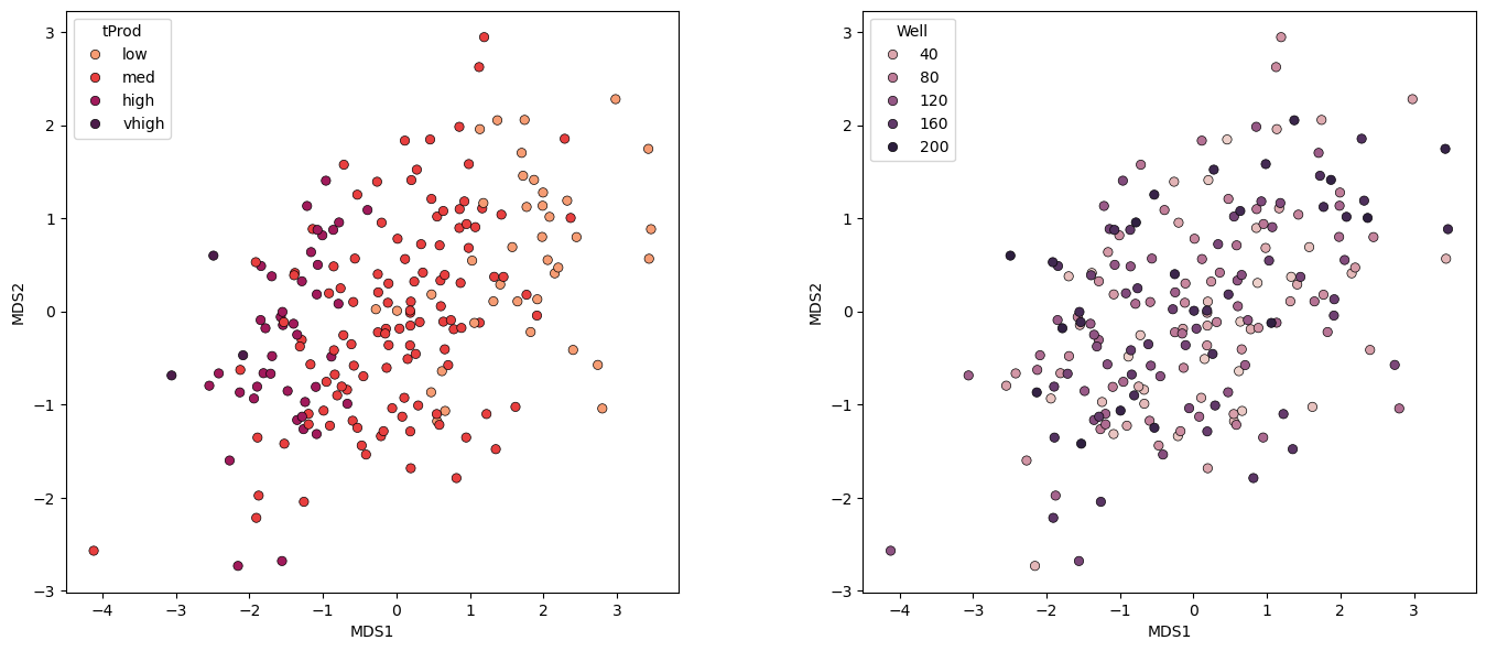
Let’s take a look at the samples projected into the new 2 dimensional feature space.
note the rotation, translation is arbitrary in this space, only the sample pairwise distances are relevant.
plt.subplot(121)                                              # plot labeled MDS projection
pairplot = sns.scatterplot(x = df['MDS1'],y = df['MDS2'],hue = df['tProd'],markers='o',palette = dpalette,edgecolor="black")

plt.subplot(122)
pairplot = sns.scatterplot(x = df['MDS1'],y = df['MDS2'],hue = df['Well'],markers='o',edgecolor="black")

plt.subplots_adjust(left=0.0, bottom=0.0, right=2., top=1.1, wspace=0.3, hspace=0.2,); plt.show()
Some comments:
these are the actual samples in this space, we know the values, including the sample number to assist with interpretations
the general relationship between samples is preserved.
the general production transition from low to very high production is preserved.
Let’s check our model:
we will calculate the original and projected pairwise distances between all the samples
we will cross plot the original vs the projects pairwise distances
we will plot the distribution of the ratio between projects / original pairwise distances
dists = euclidean_distances(df[nXname], squared=False).ravel() # calculate pairwise distance
nonzero = dists != 0                                          # select only non-identical samples pairs
dists = dists[nonzero]
projected_dists = euclidean_distances(MDS_transformed, squared=False).ravel()[nonzero] # calculate projected pairwise distance

plt.subplot(221)                                              # scatter plot original and projected pairwise distance
plt.scatter(dists,projected_dists,c='darkorange',alpha=0.4,edgecolor = 'black')
plt.arrow(0,0,200,200,width=0.02,color='black',head_length=0.0,head_width=0.0)
plt.xlim(0,15); plt.ylim(0,15); add_grid()
plt.xlabel("Pairwise Distance: original space"); plt.ylabel("Pairwise Distance: projected space")
plt.title("MDS Pairwise Distance: Projected to %d Components" % n_components)

ratio = projected_dists / dists                               # calculate projected distance/original distance ratio

plt.subplot(222)                                              # histogram of distance ratio
plt.hist(ratio, bins=50, range=(0.5, 1.5),color = 'darkorange',alpha = 0.8,edgecolor='k')
plt.xlabel("Distance Ratio: projected / original"); plt.ylabel("Frequency"); add_grid()
plt.title("MDS Pairwise Distance: Projected to %d Components" % n_components)
plt.annotate('Distance Ratio:',[0.55,9000])
plt.annotate('mean = ' + str(round(np.mean(ratio),2)),[0.61,8300])
plt.annotate('st.dev. = ' + str(round(np.std(ratio),2)),[0.61,7600])

plt.subplot(223)                                               # histogram of original pairwise distance
plt.hist(dists, bins=50, range=(0., 15.),color = 'darkorange',alpha = 0.8,edgecolor='k'); add_grid()
plt.xlabel("Pairwise Distance"); plt.ylabel("Frequency"); plt.title("MDS Pairwise Distance: Original Data"); plt.xlim(xmin=0)
plt.annotate('Original Pairwise Distance:',[9,4000]); plt.ylim([0,5500])
plt.annotate('mean = ' + str(round(np.mean(dists),2)),[10,3700])
plt.annotate('st.dev. = ' + str(round(np.std(dists),2)),[10,3400])

plt.subplot(224)                                               # histogram of projected pairwise distance
plt.hist(projected_dists, bins=50, range=(0., 15.),color = 'darkorange',alpha = 0.8, edgecolor='k')
plt.xlabel("Pairwise Distance"); plt.ylabel("Frequency"); add_grid(); plt.xlim(xmin=0); plt.ylim([0,5500])
plt.title("MDS Pairwise Distance: Projected to %d Components" % n_components)
plt.annotate('Original Pairwise Distance:',[9,4000])
plt.annotate('mean = ' + str(round(np.mean(projected_dists),2)),[10,3700])
plt.annotate('st.dev. = ' + str(round(np.std(projected_dists),2)),[10,3400])

plt.subplots_adjust(left=0.0, bottom=0.0, right=1.6, top=1.7, wspace=0.2, hspace=0.3); plt.show()
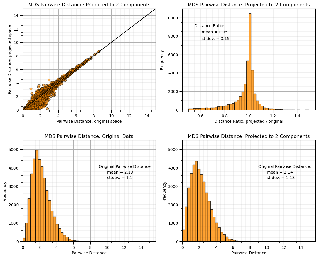
We projected to a 2 dimensional feature space and did a pretty good job preserving the pairwise distances between the samples.
Observing Specific Samples#
Let’s reduce the number of wells and post the well numbers to observe their spacings in the original and projected features spaces.
df_subset = df.sample(n = 30,random_state = seed+5).copy(deep = True)           # randomly sample 30 data without replacement
df_subset = df_subset.reset_index()
Let’s look at out dataset, we will visualize the 3 possible scatter plots between the three features with the sample points labeled by well number (1 through 30).
plt.subplot(311)
pairplot = sns.scatterplot(x = df_subset[nXname[0]],y = df_subset[nXname[1]],s=60,
        hue = df_subset['tProd'],edgecolor="black",markers='o')
plt.xlabel(nXlabelunit[0]); plt.ylabel(nXlabelunit[1]); add_grid();
plt.xlim([nXmin[0],nXmax[0]]); plt.ylim([nXmin[1],nXmax[1]]); plt.title('30 Samples, ' + str(Xlabel[1]) + ' vs. ' + str(Xlabel[0]))
for i, txt in enumerate(df_subset['Well']):
    pairplot.annotate(txt, (df_subset[nXname[0]][i]+0.1, df_subset[nXname[1]][i]+0.1))

plt.subplot(312)
pairplot = sns.scatterplot(x = df_subset[nXname[1]],y = df_subset[nXname[2]],s=60,
        hue = df_subset['tProd'],edgecolor="black",markers='o')
plt.xlabel(nXlabelunit[1]); plt.ylabel(nXlabelunit[2]); add_grid();
plt.xlim([nXmin[1],nXmax[1]]); plt.ylim([nXmin[2],nXmax[2]]); plt.title('30 Samples, ' + str(Xlabel[2]) + ' vs. ' + str(Xlabel[1]))
for i, txt in enumerate(df_subset['Well']):
    pairplot.annotate(txt, (df_subset[nXname[1]][i]+0.1, df_subset[nXname[2]][i]+0.1))

plt.subplot(313)
pairplot = sns.scatterplot(x = df_subset[nXname[0]],y = df_subset[nXname[2]],s=60,
        hue = df_subset['tProd'],edgecolor="black",markers='o')
plt.xlabel(nXlabelunit[0]); plt.ylabel(nXlabelunit[2]); add_grid();
plt.xlim([nXmin[0],nXmax[0]]); plt.ylim([nXmin[2],nXmax[2]]); plt.title('30 Samples, ' + str(Xlabel[2]) + ' vs. ' + str(Xlabel[0]))
for i, txt in enumerate(df_subset['Well']):
    pairplot.annotate(txt, (df_subset[nXname[0]][i]+0.1, df_subset[nXname[2]][i]+0.1))

plt.subplots_adjust(left=0.0, bottom=0.0, right=1.0, top=3.1, wspace=0.3, hspace=0.2); plt.show()
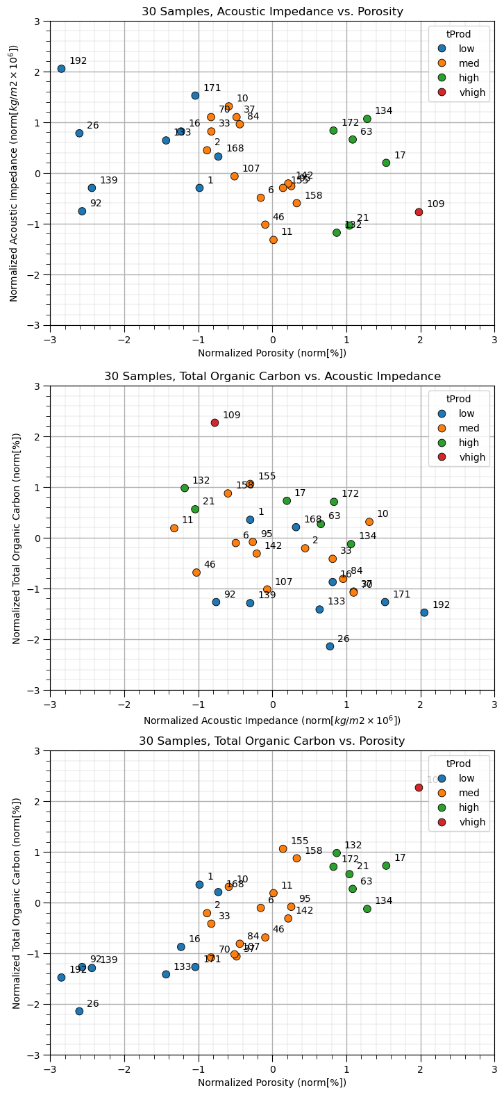
We can now see our 30 wells with their sample numbers plots on each of the 3 possible bivariate plots. Let’s perform multidimensional scaling to project 2 components.
embedding_subset = MDS(n_components=2)                        # MDS projection
MDS_transformed_subset = embedding_subset.fit_transform(df_subset[nXname])
Now let’s visualize the wells in the projected feature space.
plt.subplot(121)                                              # plot data samples in MDS space
pairplot = sns.scatterplot(x = MDS_transformed_subset[:,0],y = MDS_transformed_subset[:,1],s=60,
        hue = df_subset['tProd'],edgecolor="black",markers='o')
for i, txt in enumerate(df_subset['Well'].values):
    plt.annotate(txt, [MDS_transformed_subset[:,0][i]+0.1,MDS_transformed_subset[:,1][i]+0.1])
plt.xlim([-3.5,3.5]); plt.ylim([-3.5,3.5]); plt.title('30 Samples, MDS#2 vs. MDS#1')
pairplot.set_xlabel('MDS1'); pairplot.set_ylabel('MDS2')
pairplot.legend(loc='lower right'); add_grid(); plt.legend(loc = 'upper right')

dists = euclidean_distances(df_subset[nXname], squared=False).ravel() # calculate all pairwise distances
nonzero = dists != 0                                          # select only non-identical samples pairs
dists = dists[nonzero]
projected_dists = euclidean_distances(MDS_transformed_subset, squared=False).ravel()[nonzero] # calculate projected pairwise distance

plt.subplot(122)                                              # scatter plot original and projected pairwise distance
plt.scatter(dists,projected_dists,c='darkorange',alpha=0.4,edgecolor = 'black')
plt.arrow(0,0,200,200,width=0.02,color='black',head_length=0.0,head_width=0.0)
plt.xlim(0,15); plt.ylim(0,15); add_grid()
plt.xlabel("Pairwise Distance: original space"); plt.ylabel("Pairwise Distance: projected space")
plt.title("MDS Pairwise Distance: Projected to %d Components" % n_components)

plt.subplots_adjust(left=0.0, bottom=0.0, right=2., top=1.1, wspace=0.3, hspace=0.2); plt.show()
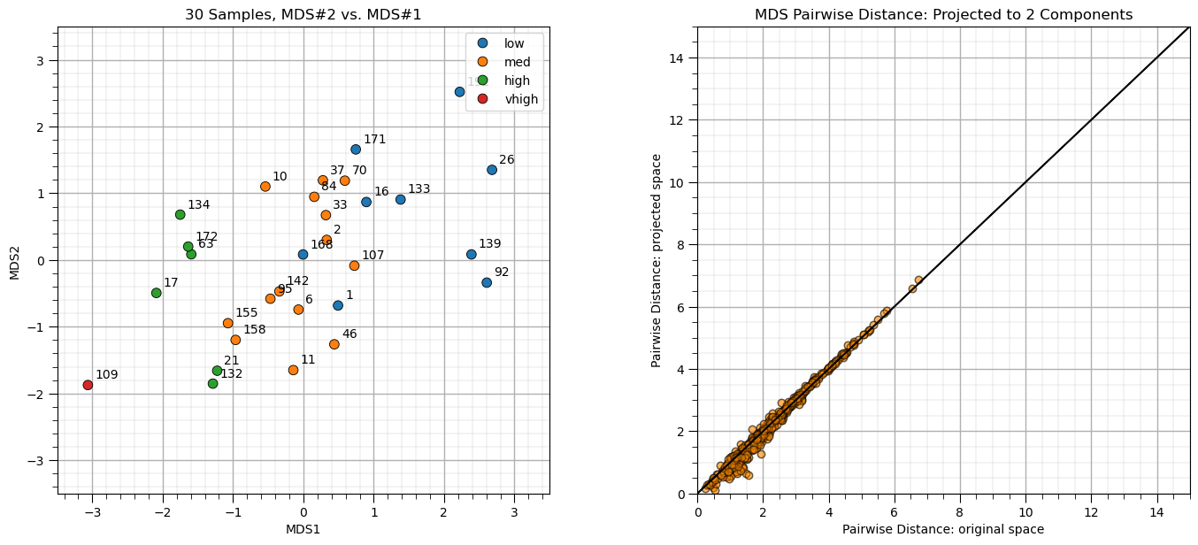
Some observations:
the transformation is nonlinear, nor orthogonal, i.e., not a rotation (like PCA)
the inter-sample distance is approximately preserved
Applications of MDS#
The main application with multidimensional scaling is the ability to inspect high dimensional feature spaces for relationships between samples.
we may observe that specific wells cluster together
we may observe systematic transitions
For example, in the figure above we could observe:
Wells 1 and 168 are in a location of medium producing wells, but are low producing wells.
Well 70 is close to the many low producing well, but is a medium producing well.
Wells 155 and 158 are in a location of high producing wells, but are medium producing wells.
This analysis may identify opportunities for further investigation into these specific data samples. Perhaps there are data issues or other confounding features to integrate.
Recall, MDS is a one-way-trip.
While we can project the data into MDS space, there is no backtransformation; therefore, we cannot take an arbitrary location in MDS space and calculate the original feature combination.
The solution is nonunique with respect to translation, rotation and flipping. Our interpretation is based on separation distance and groupings in MDS space.
The calculation is performed each time we change the data resulting in a new solution.
Want to Work Together?#
I hope this content is helpful to those that want to learn more about subsurface modeling, data analytics and machine learning. Students and working professionals are welcome to participate.
Want to invite me to visit your company for training, mentoring, project review, workflow design and / or consulting? I’d be happy to drop by and work with you!
Interested in partnering, supporting my graduate student research or my Subsurface Data Analytics and Machine Learning consortium (co-PI is Professor John Foster)? My research combines data analytics, stochastic modeling and machine learning theory with practice to develop novel methods and workflows to add value. We are solving challenging subsurface problems!
I can be reached at mpyrcz@austin.utexas.edu.
I’m always happy to discuss,
Michael
Michael Pyrcz, Ph.D., P.Eng. Professor, Cockrell School of Engineering and The Jackson School of Geosciences, The University of Texas at Austin
More Resources Available at: Twitter | GitHub | Website | GoogleScholar | Geostatistics Book | YouTube | Applied Geostats in Python e-book | Applied Machine Learning in Python e-book | LinkedIn


Comments#
This was a basic treatment of multidimensional scaling. Much more could be done and discussed, I have many more resources. Check out my shared resource inventory and the YouTube lecture links at the start of this chapter with resource links in the videos’ descriptions.
I hope this is helpful,
Michael